

Crafted Communications: Turning Complex Strategy into Clear Storytelling
Squarespace Website Design, Copy Refinement, Animation, UX Strategy, Mobile Optimization
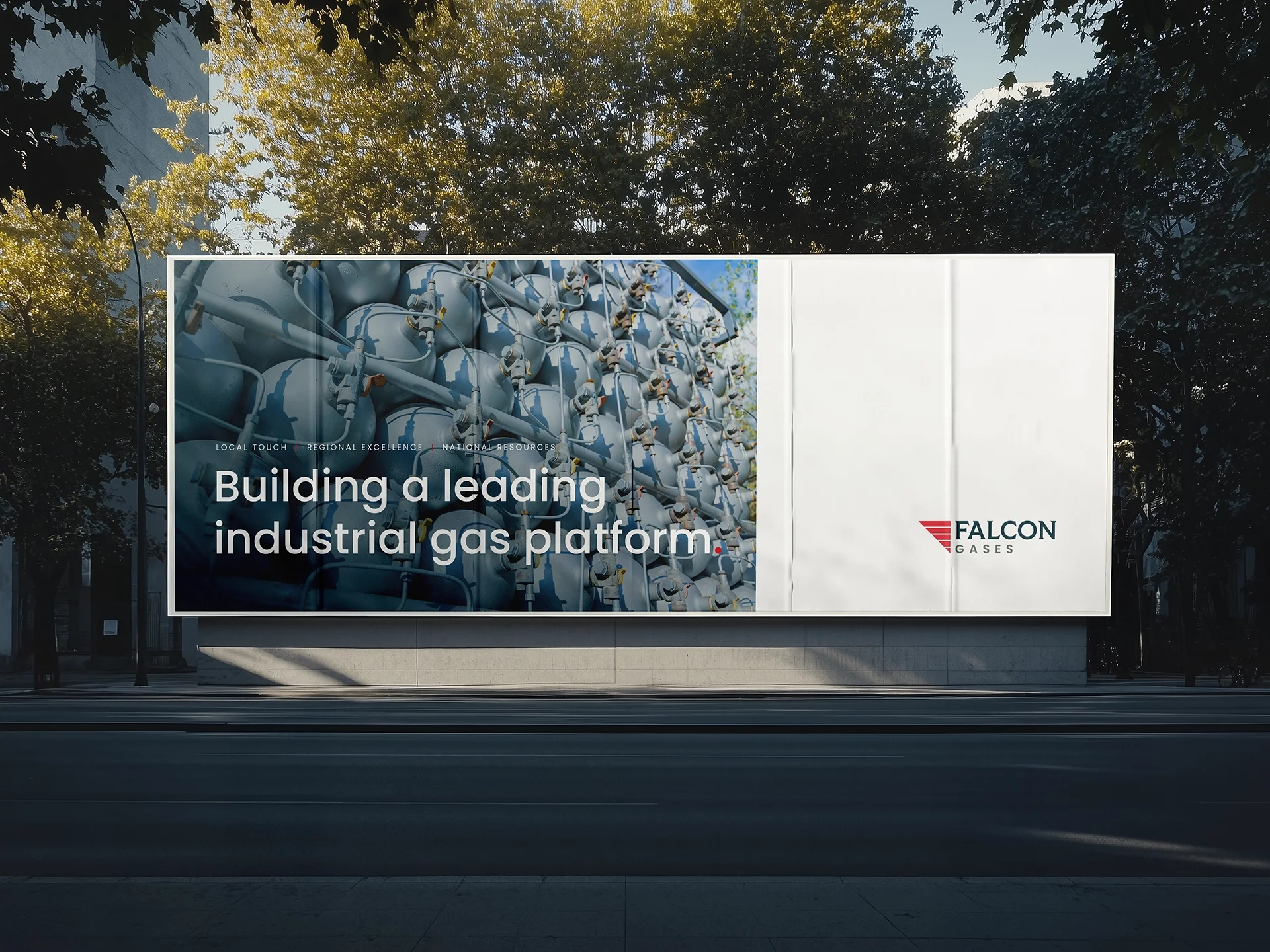
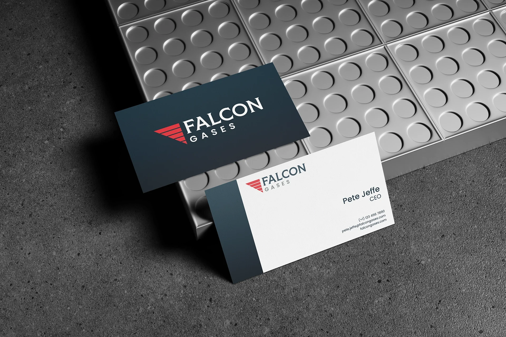
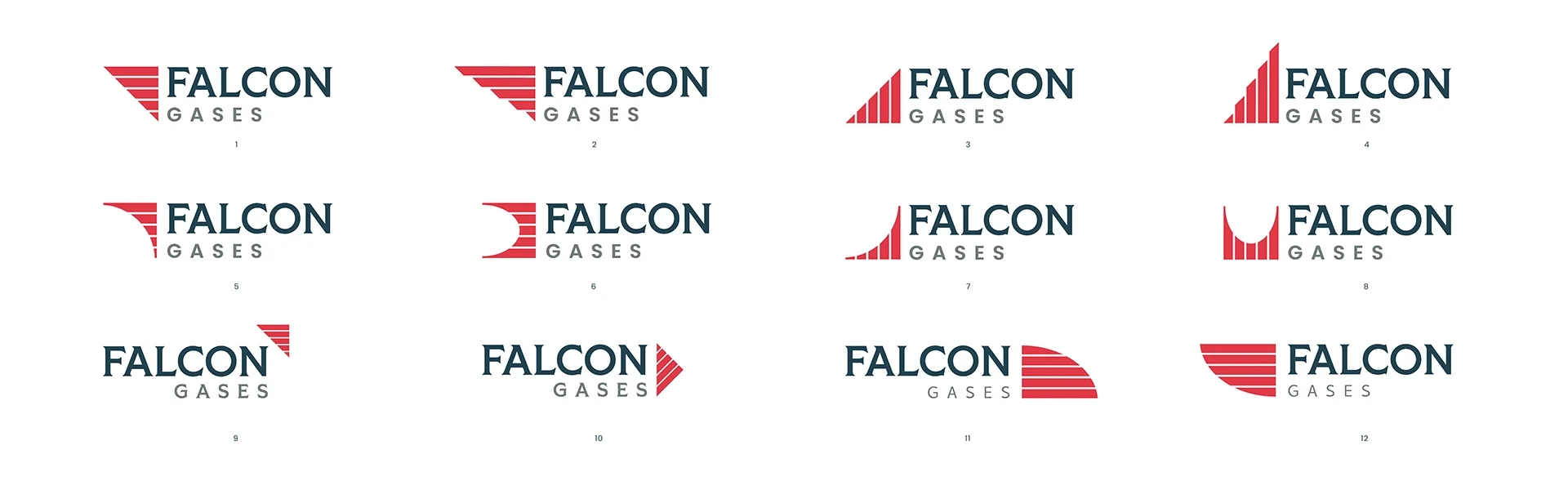
Falcon Gases came to me as an early-stage startup with big goals and a tight timeline. They had the bones of a website, but it needed polish, clarity, and a strong mobile experience before an upcoming investor review. On top of that, their logo felt dated. They wanted a mark that nodded to their industrial roots—clean, bold, and symbolic—without leaning on tired clichés.
Client
Falcon Gases
⸻
Services
Logo + Brand Identity
Squarespace Website
UX/UI Design
Copywriting
Mobile Optimization
Investor Presentation
⸻
Year
2025


Challenge
When Mohamud reached out, Crafted Communications already had a half-built Squarespace site—a strong concept, but not yet the refined, responsive brand experience it needed to represent the company’s ethos of clarity and simplicity.
The goal was straightforward but ambitious: transform a partially built idea into a sleek, finished website that balanced professionalism with personality. Mohamud wanted a design that didn’t just look good—it had to feel intentional and communicate trust at every scroll.
Approach
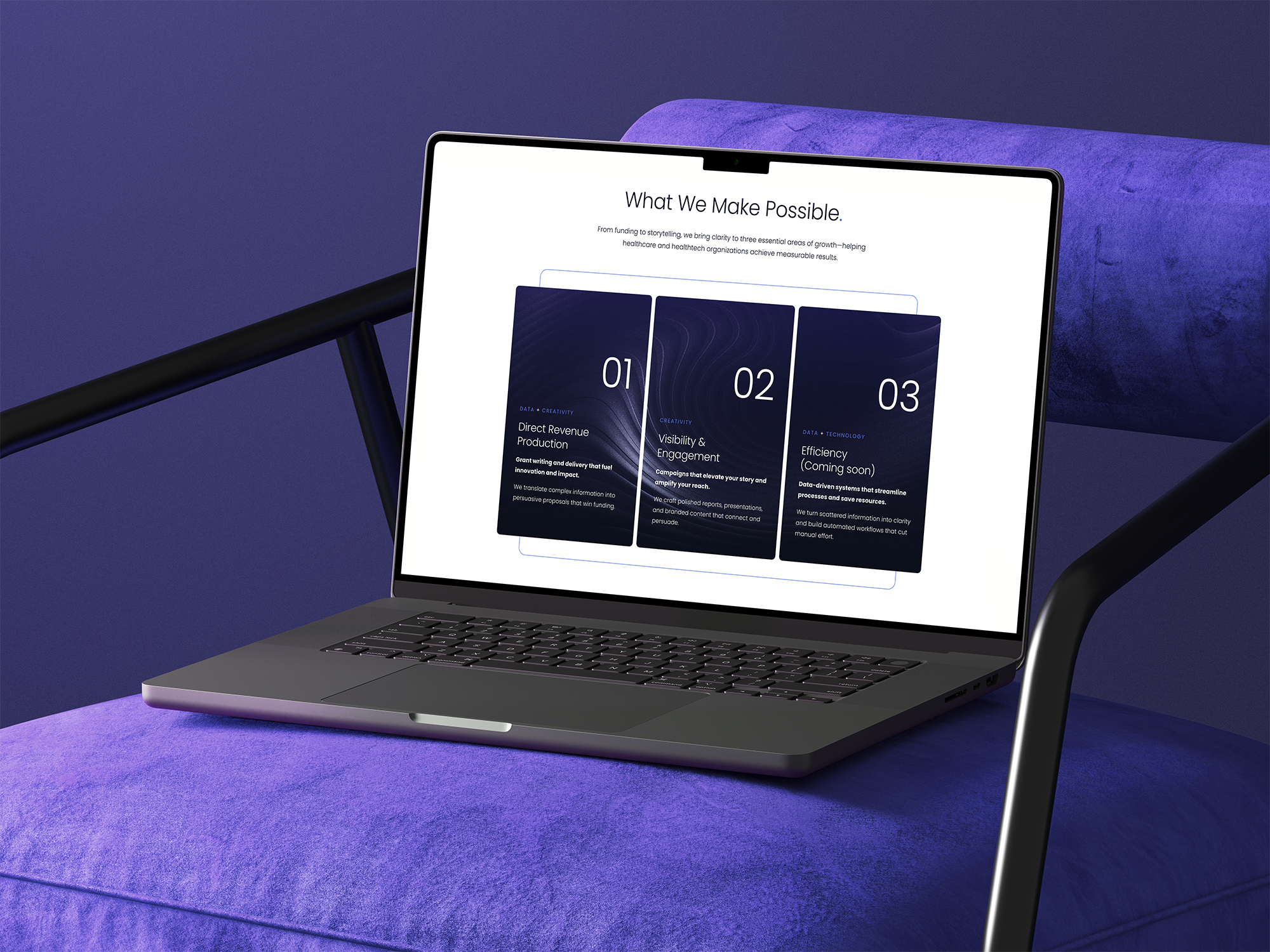
We started by rebuilding the homepage from the ground up—using the existing brand palette as a foundation while rethinking flow, messaging, and visual rhythm. Every section was designed to move the visitor naturally from first impression to confident action, avoiding clutter and redundancy.
To make the Crafted story tangible, we introduced two playful 3D avatars—Noise and Clarity—as visual metaphors for transformation. This subtle storytelling device made the abstract concept of “From Noise → Clarity” instantly understandable and visually engaging.
Key design and strategy elements included:
Refined Brand Hierarchy: Updated typography and color system to bring visual cohesion across all pages.
Modular Content Flow: Crafted each section to guide visitors through awareness, trust, proof, and conversion.
Interactive Animations: Integrated Squarekicker for custom animations and motion that reinforced the “clarity emerging from noise” theme.
Copy Optimization: Simplified messaging for sharper conversion impact, balancing strategic tone with crafted personality.
Responsive Design: Rebuilt layouts for mobile and tablet for a seamless browsing experience.
"Good designers that are also aligned with the Customer vision are rare; Justin is one of those rare ones. We contracted his services to help us redesign our squarespace based portfolio. From the start, Justin took on the project as if it were his own. He carefully scoped out the project requirements and kept us in the loop throughout. The end result was better than what I had been hoping for. I highly recommend Justin to anyone seeking stellar web design. Thank you Justin!"
Mohamud Ali
Founder of Crafted Communications
Results
The final website delivered a high-end, modern interface that perfectly captured Crafted’s mission of bringing clarity to complex communication challenges.
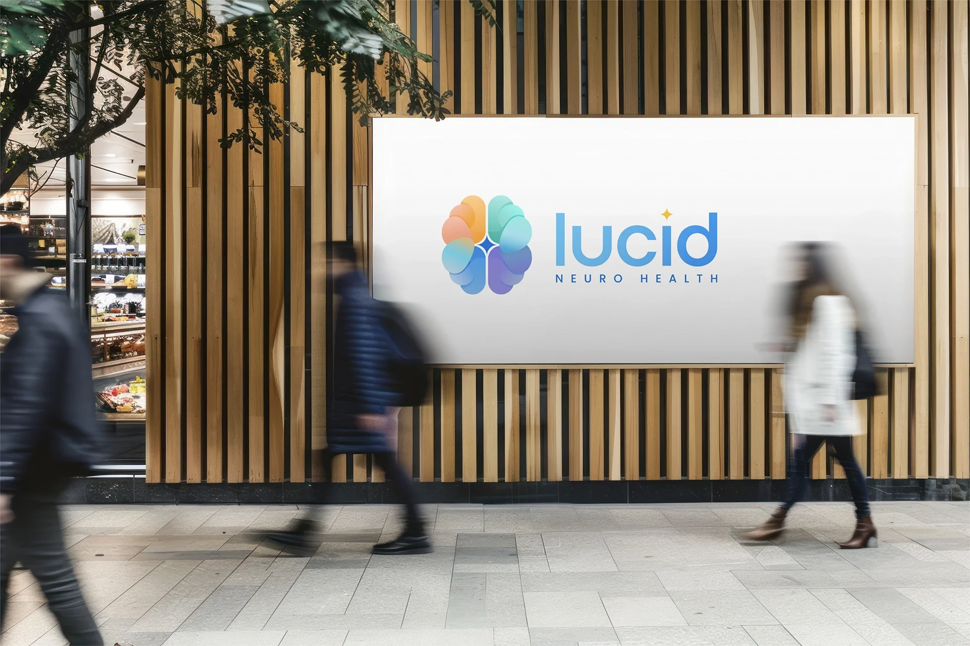
Lucid Neuro Health
We partnered with Lucid Neuro Health to design a logo and brand that balances scientific credibility with human warmth. The final mark is an abstract brain composed of four softly blended pillars — symbolizing sleep, nutrition, exercise, and intellectual engagement — brought to life with calming gradients and a tactile, textured finish.


Bring Your Vision to Life.
Start things off with a free discovery call, and let’s start shaping a design that truly reflects your vision.