The Logo That Wasn't in the Brief
A brand mark for Lucid NeuroHealth · 2025
Ara reached out about Lucid NeuroHealth with a pretty clear ask: a logo that felt modern, clinical, premium, and patient-centered. Lucid's a preventative neurology platform — they help people think sharper, age healthier, and feel good about what's going on upstairs. So the mark had a lot riding on it. Scientific but not cold. Trustworthy but not stiff. Calm but not boring.
Mostly it just needed to say "brain health" without doing the obvious brain thing. No neuron clipart. We were very clear on that.
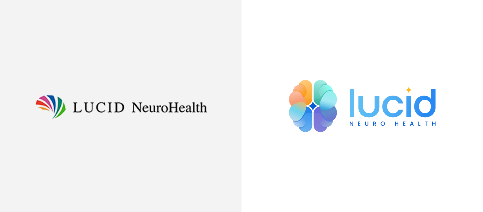
Before and after - and yes, that is the highest resolution anyone had of the original logo
Ara knew exactly how Lucid should feel, which honestly does half the work for me. He described it as "Stanford Neurology meets Calm app," and that one line gave me the whole tension of the project right away: clinical authority on one side, soft and human on the other.
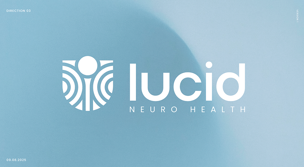
He also showed up with a real idea, not just a vibe. He wanted to explore the "U" in Lucid as the hero — the patient at the center of care, a protective shape, a pathway, maybe even a little nod to the magnetic arcs in TMS therapy. It was thoughtful and gave the first round a solid foundation to push against.
The "U" didn't make the final logo though. We'll get to that.
For the first pass I made five directions. Some leaned clinical, some leaned protective and patient-first, a few chased the science — gamma symbols, magnetic arcs, TMS coils, abstract brain shapes.
The point of round one is never to nail it immediately. It's to give the client a few different ways to see their brand so you can both figure out what feels right, what feels too expected, and what's actually got legs. Sometimes the first round is less about the final logo and more about finding the right door in.
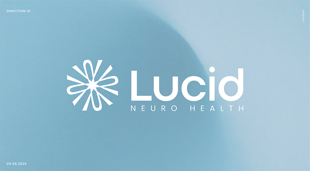
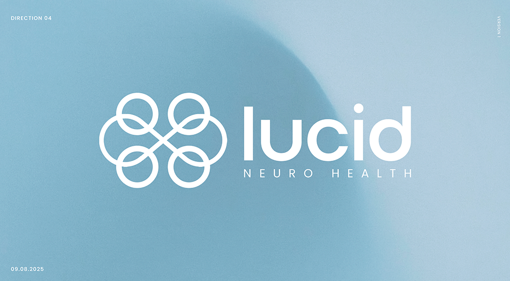
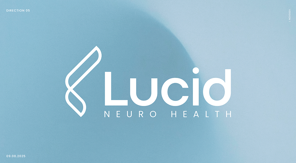
Ara's favorite wasn't a "U" concept at all. It was Direction 05 — an abstract gamma symbol reshaped into an "L" for Lucid. Rooted in science, but ownable, and it didn't feel overly medical.
Then he brought in an idea that changed everything. Could we take the color and gradient energy from one direction, the layout from another, and build an abstract brain around Lucid's four pillars of brain wellness — sleep, nutrition, exercise, and intellectual engagement?
That was the turning point. Suddenly the mark wasn't representing neurology in some general way. It was representing Lucid's specific take on brain health. The brief pointed at the "U." Ara's gut pointed at the brain. The better answer was the one that wasn't in the brief at all, which is usually how it goes when a client really knows their thing.
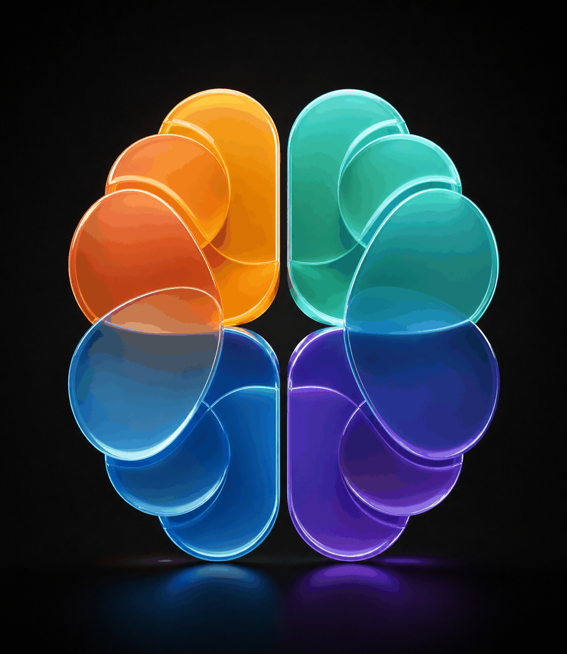
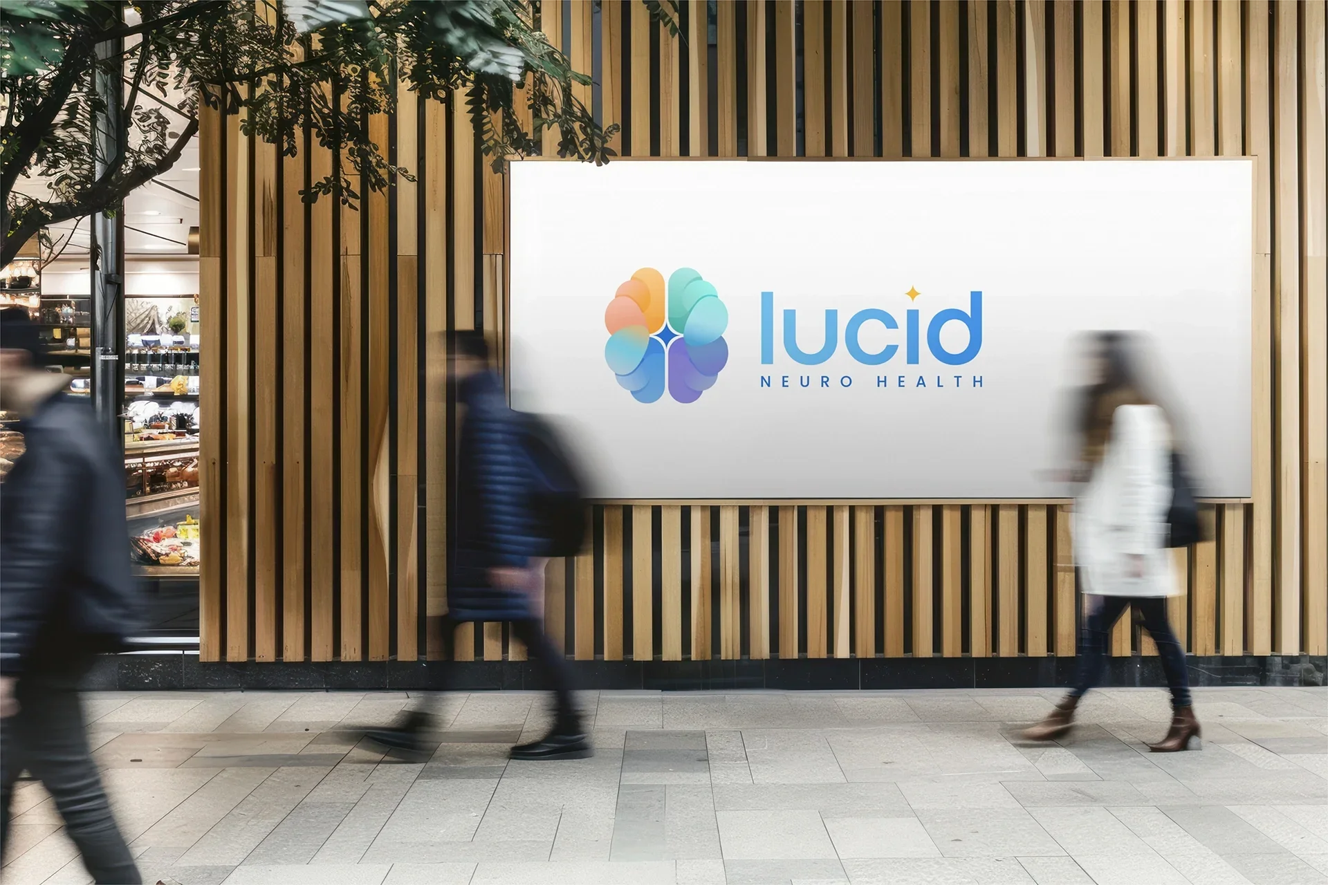
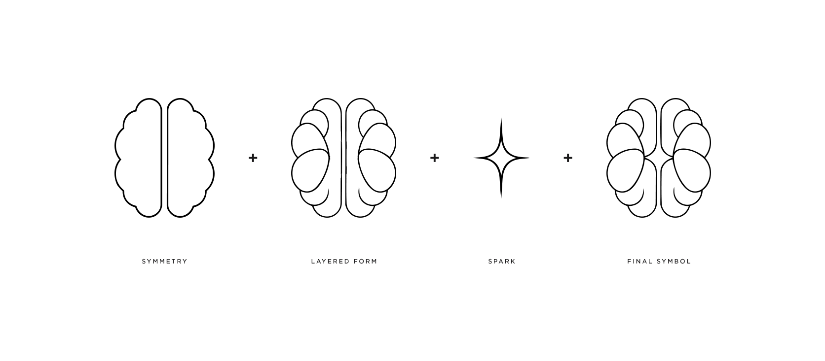
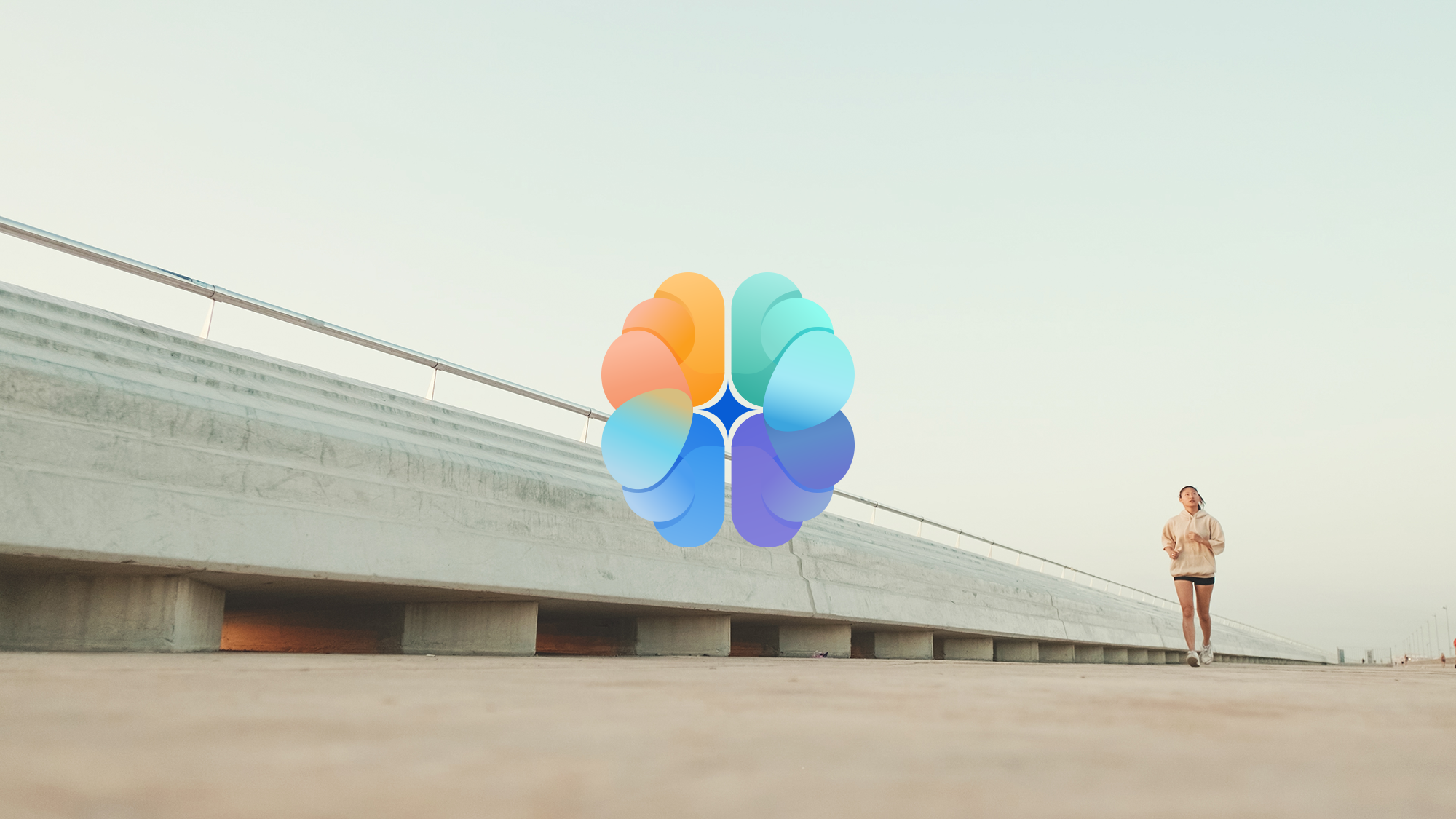
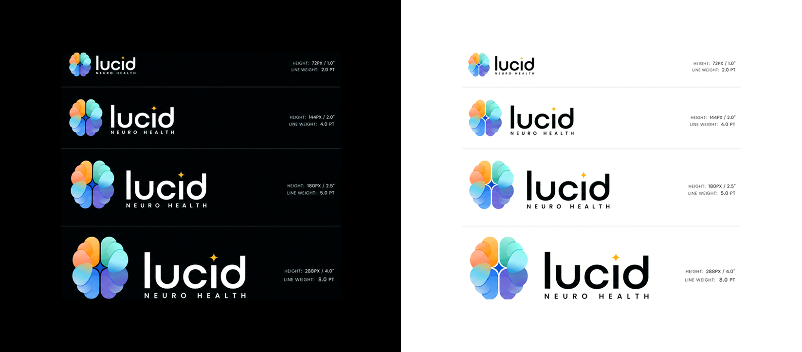
The final logo is a layered, colorful, brain-inspired symbol with a small spark at the center.
The stacked forms read as a brain, but a softer, more modern one — less medical diagram, more a system of parts working together toward clarity. The spark in the middle ended up being my favorite part. A little moment of light for clarity, insight, and vitality. Once it was there, echoing it in the dot of the "i" in Lucid just made sense, and that small move tied the icon and wordmark together so the whole thing felt like one system instead of a symbol parked next to a name.
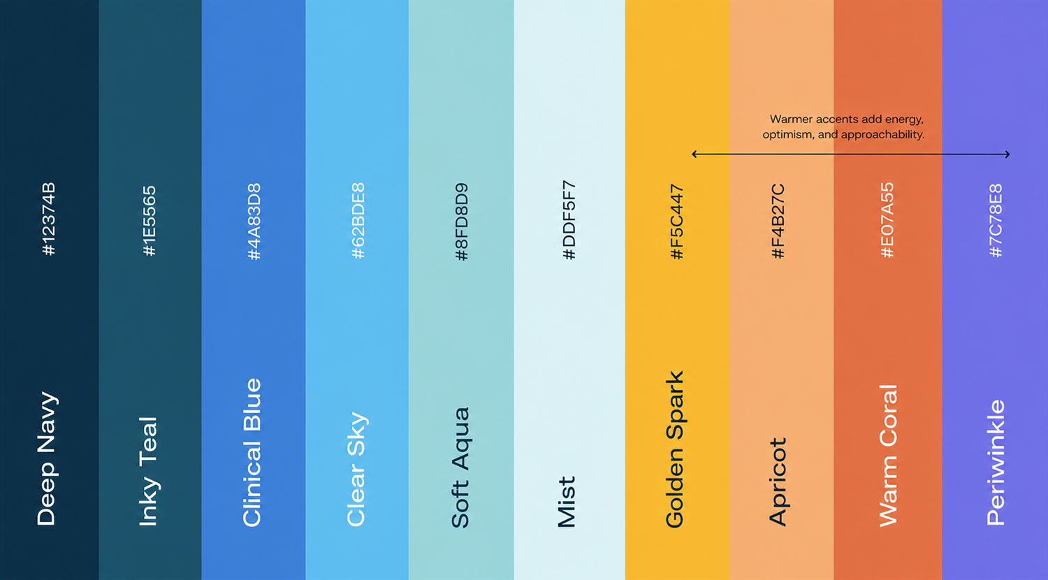
Color mattered a lot here. Lucid already had a blue palette, which tracks — blue carries trust, calm, and clinical clarity. But all blue and the brand starts to feel cold.
So I brought in some warmth — orange, yellow, a bit of gradient movement — for energy and optimism, without making it feel playful or unserious. Brain health can be heavy. People show up to a preventative neurology platform carrying real worry, and the design needed to respect that while still leaving room for possibility.
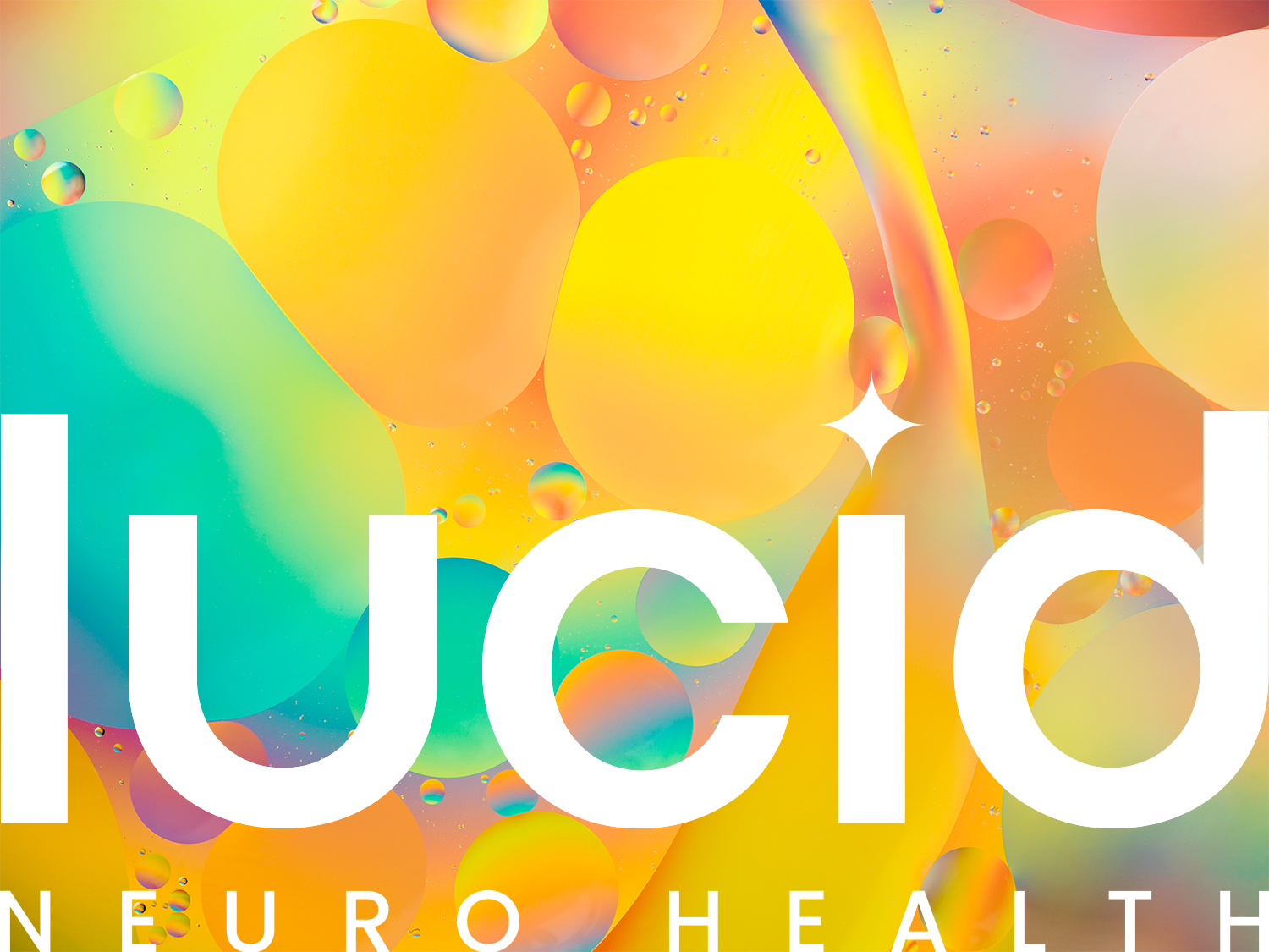

For the wordmark I kept things clean, rounded, and modern. "Lucid" needed to feel approachable and easy to read, "Neuro Health" more structured and precise underneath it. The spark over the "i" gave it a little personality without getting decorative. Small detail, but those are usually the ones that make a mark feel ownable.
Lucid ended up with a mark that's bright, clinical, and patient-centered — science and warmth in the same frame, which was the whole assignment from that first "Stanford meets Calm" text.
A Lucid logo couldn't just look like neurology. It had to look like Lucid's version of it: preventative, thoughtful, modern, and built to help people move through complicated, sometimes scary information with a little more clarity and confidence.
For something that started as a focused logo project, it quietly laid the groundwork for everything next — website, signage, patient materials, presentations, the whole visual world around the brand. Not bad for a logo that wasn't in the brief.
More from Inflow
Did you like this project? Want to work with me and make some cool stuff together? Send me an email at → contact.inflowdesigns@gmail.com