Different Formats, Same Brand — Delivered Fast
Website, identity, and ongoing design for Falcon Gases · 2025
Some projects start as a website.
Then they quietly become a logo project. Then a mobile cleanup. Then a one-page investor teaser. Then a PowerPoint template. Then business cards to four cities. Then a launch-morning text that basically reads "hey, something weird is happening on mobile."
Falcon Gases was one of those — in the best way. What started as a focused website and identity build kept growing, and Falcon moves fast: launches, investor meetings, new hires who need cards by Friday. So my job became matching that pace without ever losing quality or falling behind.
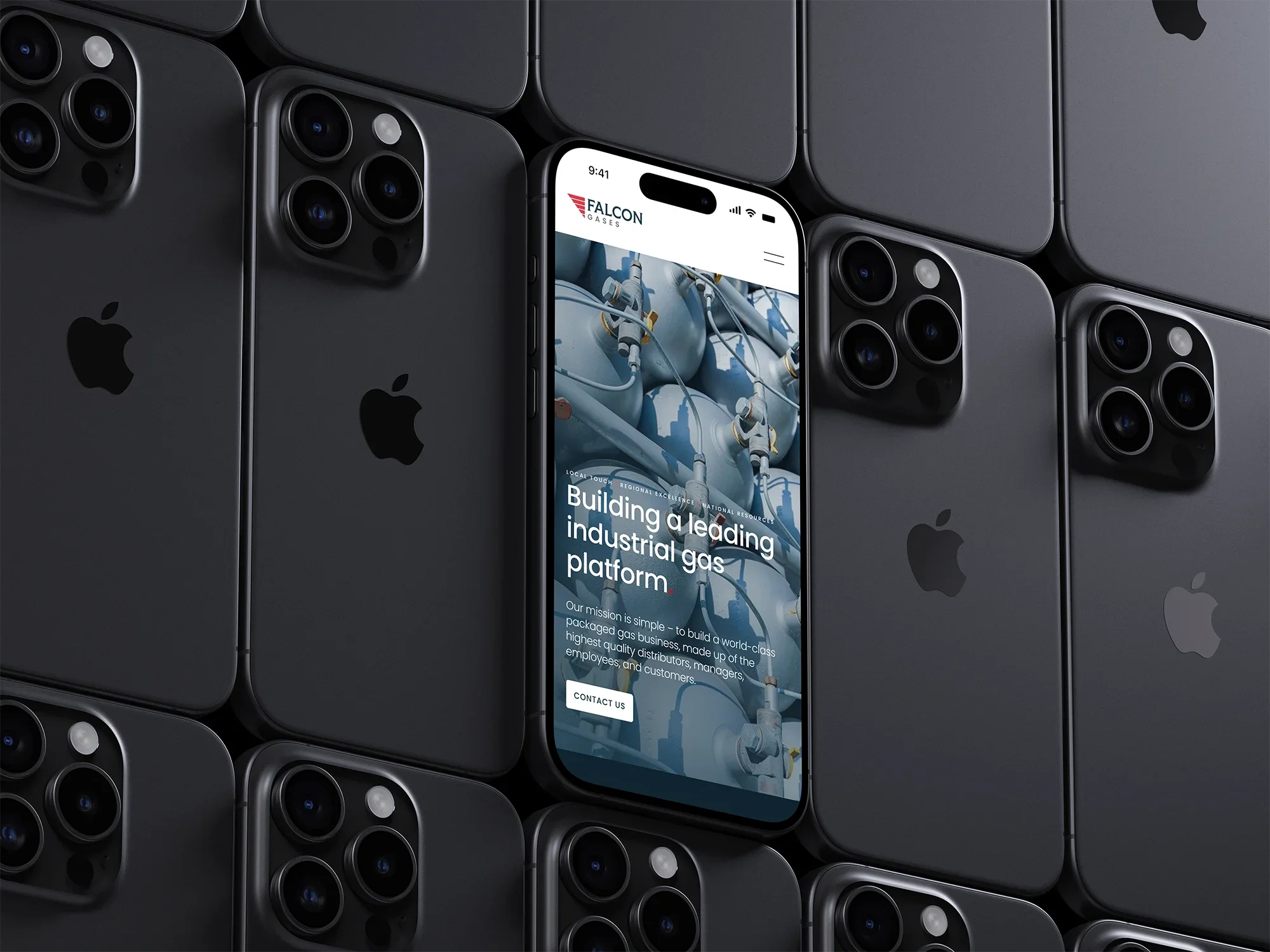
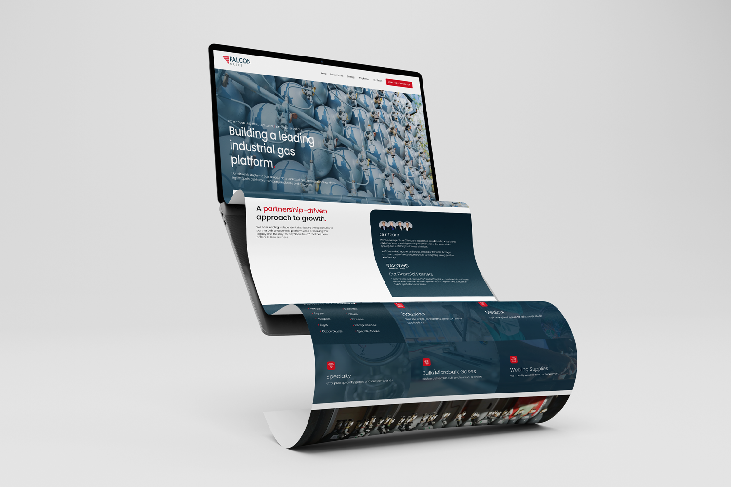
The website came first. Falcon needed a clear public face that explained who they were, what markets they served, and why their partnership-driven model mattered — a lot of practical information organized so it still felt clean and easy to move through.
The direction leaned confident and industrial: structured layouts, strong contrast, clean section breaks, a visual rhythm that read polished without getting too slick. From there it was all the less flashy pieces that make a site feel ready for actual humans instead of just ready in a design file — desktop, mobile, contact flow, team section, CTAs, a news space for the press releases coming down the pipe.
This was also where the rhythm of the whole thing got going. Notes would come in from Eric and Pete — the Contact button's dead, Pete's headshot looks pixelated, the spacing under "financial partners" went funky on mobile — and they'd go back out fixed, usually the same day.
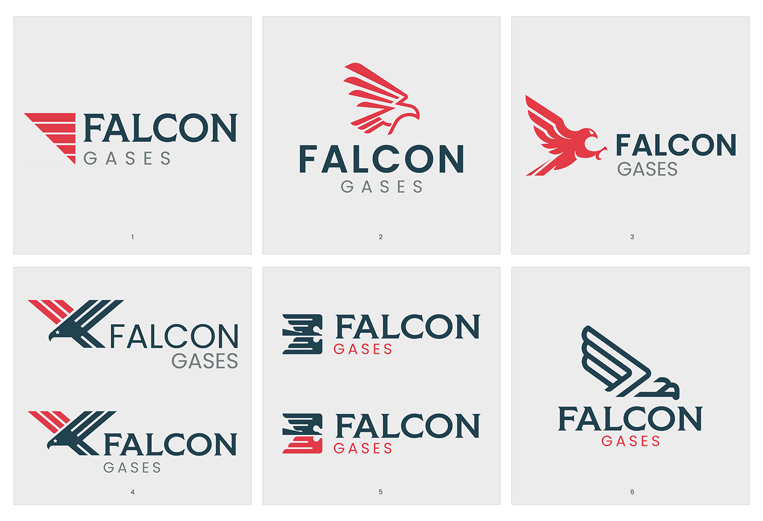
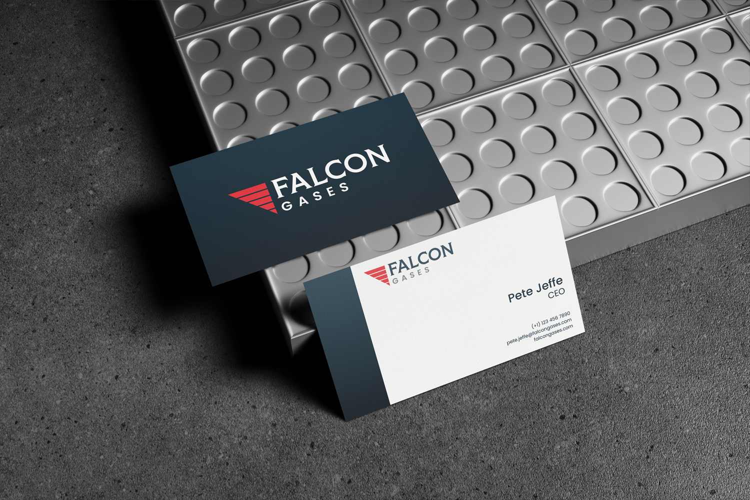
The logo started alongside the website and quickly became the anchor of the whole system. Falcon had an existing direction that needed sharpening into something stronger, cleaner, and more ownable — something that would hold up on the site, in an investor deck, on a business card, and on the golf shirts (which, yes, also happened).
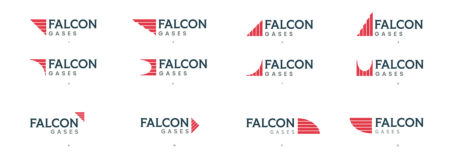
I sent six directions built around falcon wings, flag-inspired stripes, and a strong rectangular structure. Falcon zeroed in on the one with an '80s-corporate feel, and we went a couple rounds deeper from there. I was personally leaning toward the horizontal stripes, since they echo both a flag and the feathers of a wing. We landed on a mark with a left-facing triangle that doubles as an "F," stars and stripes that nod to a flag without being too on-the-nose, and a red shape that can read as either a wing or a falcon diving. Everyone was genuinely excited about it.
The mark didn't need to scream "falcon." It just needed to feel like Falcon — symbolic without being too literal, professional without feeling generic.
Most website projects technically end at launch. This one didn't really slow down.
As Falcon moved toward go-live, the work spread out into everything a brand needs in the real world. An investor wanted a one-page teaser for the financial-advisor crowd, built in PowerPoint so Eric and Pete could keep editing it. An August investor update needed branded slides. Then a reusable deck template. Business cards for four people across Brooklyn, Greenwich, and Houston — then another batch when James joined, then another when Jim came on as senior advisor. Press releases went live and the news section came out of hiding.
None of these were huge standalone projects, but they're the kind of thing where a brand can quietly start to drift — a great website doesn't help much if the deck, the cards, and the team page all feel like they came from different companies. So a lot of the work was just keeping everything feeling like one brand. Same colors, same type, same level of care. Different formats, same brand.
A good chunk of this project happened on a clock, and that's where it was the most fun.
There was a stretch right before launch where the mobile site needed attention in real time — off-center logos, a squeezed image, some whitespace that kept disappearing, a slow load on launch morning — so Eric would flag something, I'd jump on it, and we'd go back and forth until it was clean. When an investor deck needed a quick turnaround, I'd block off a few hours and knock it out. That included one I built while I was in Thailand visiting family, working around a twelve-hour time difference to have it ready for their meeting. Eric was kind about not wanting to cut into family time, but I was genuinely happy to do it.
There was even a curveball in the middle of it all. My Upwork account got shut down out of nowhere, which could have turned into a whole thing. Instead we just moved over to invoicing through Inflow directly, Eric rolled with it completely, and the work never paused.
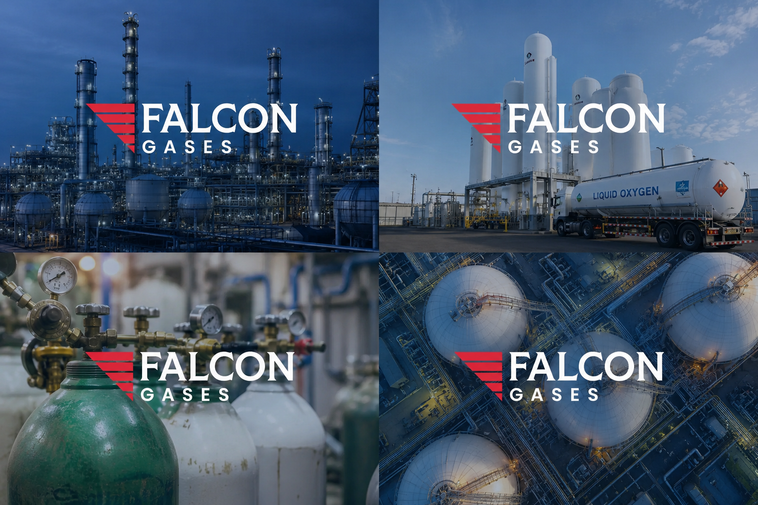
Falcon Gases launched with a website they're proud of, a refined logo, a stronger visual identity, and a growing set of branded materials that let them show up consistently across digital, print, and investor-facing touchpoints.
These days it's a pretty simple rhythm: Eric sends something over, we talk through what matters, and I get it done. There's a confidentiality agreement in place now, a steady stream of projects, and a shared shorthand that means a Friday-morning request doesn't need a long briefing to get started.
A strong foundation, a genuinely good working relationship, and somewhere around 47 tiny launch details handled along the way.
More from Inflow
Like this project? If this is the kind of work you want for your own business, let's talk. Email me at → contact.inflowdesigns@gmail.com