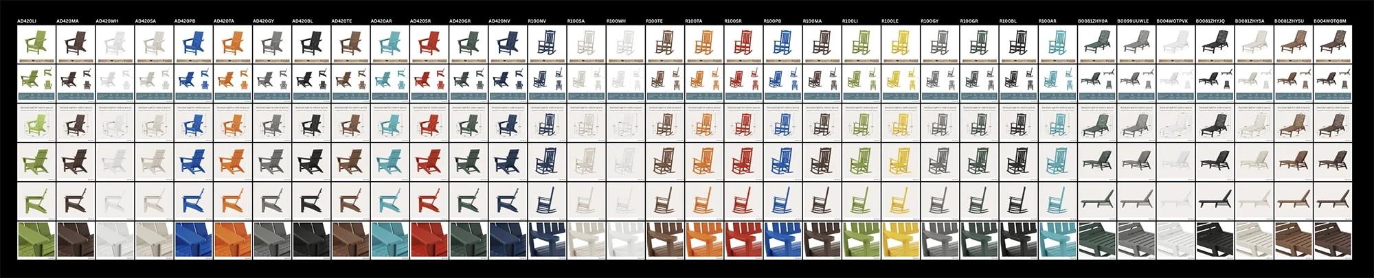
Most of my projects have one logo or one website at the finish line. POLYWOOD had 288 of almost everything.
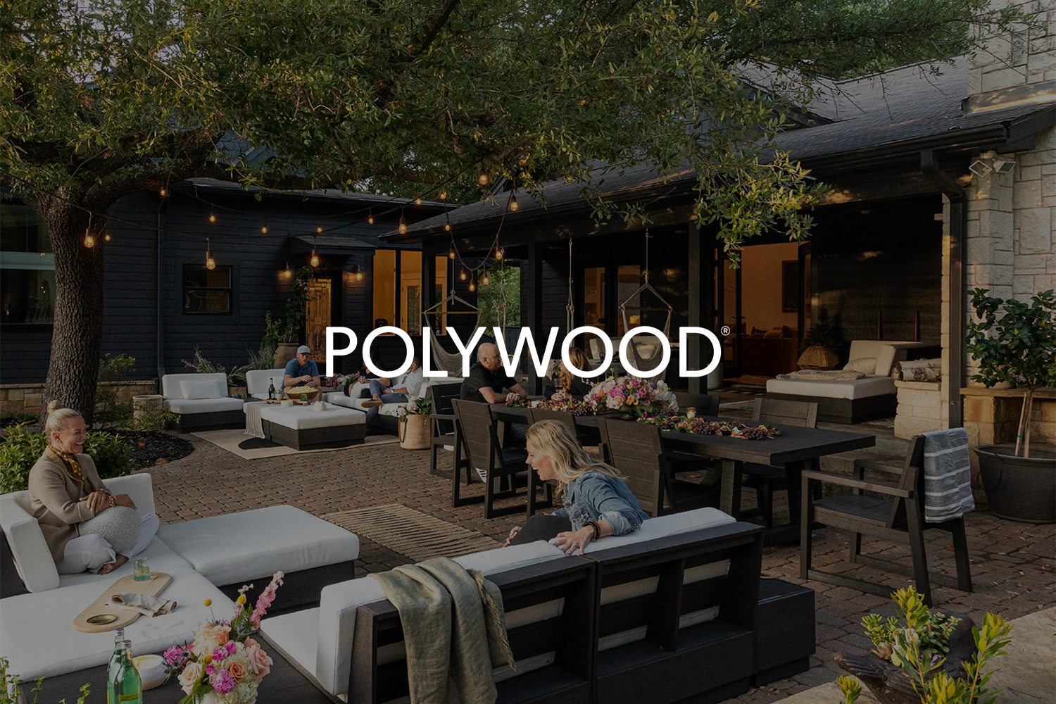
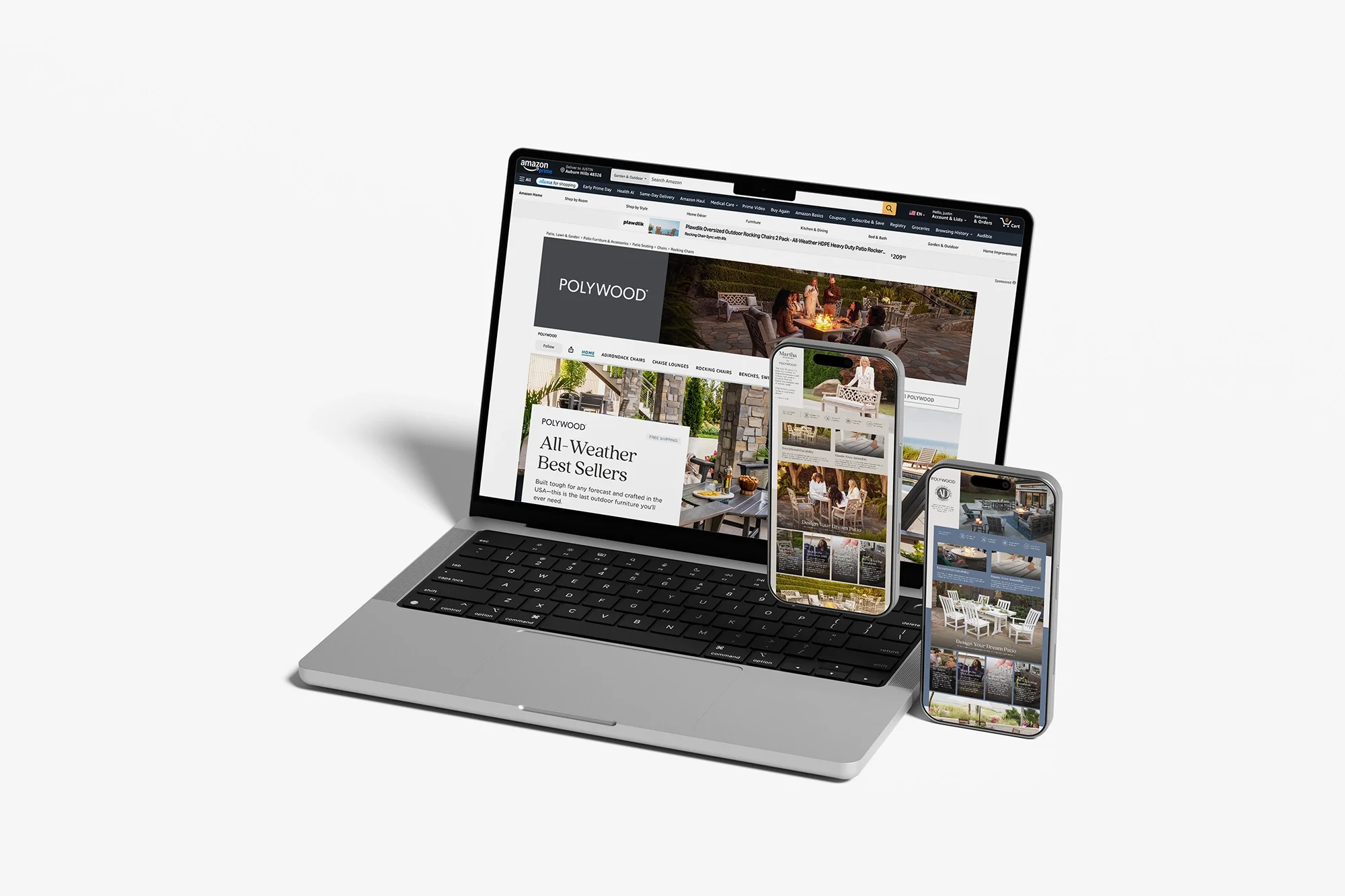
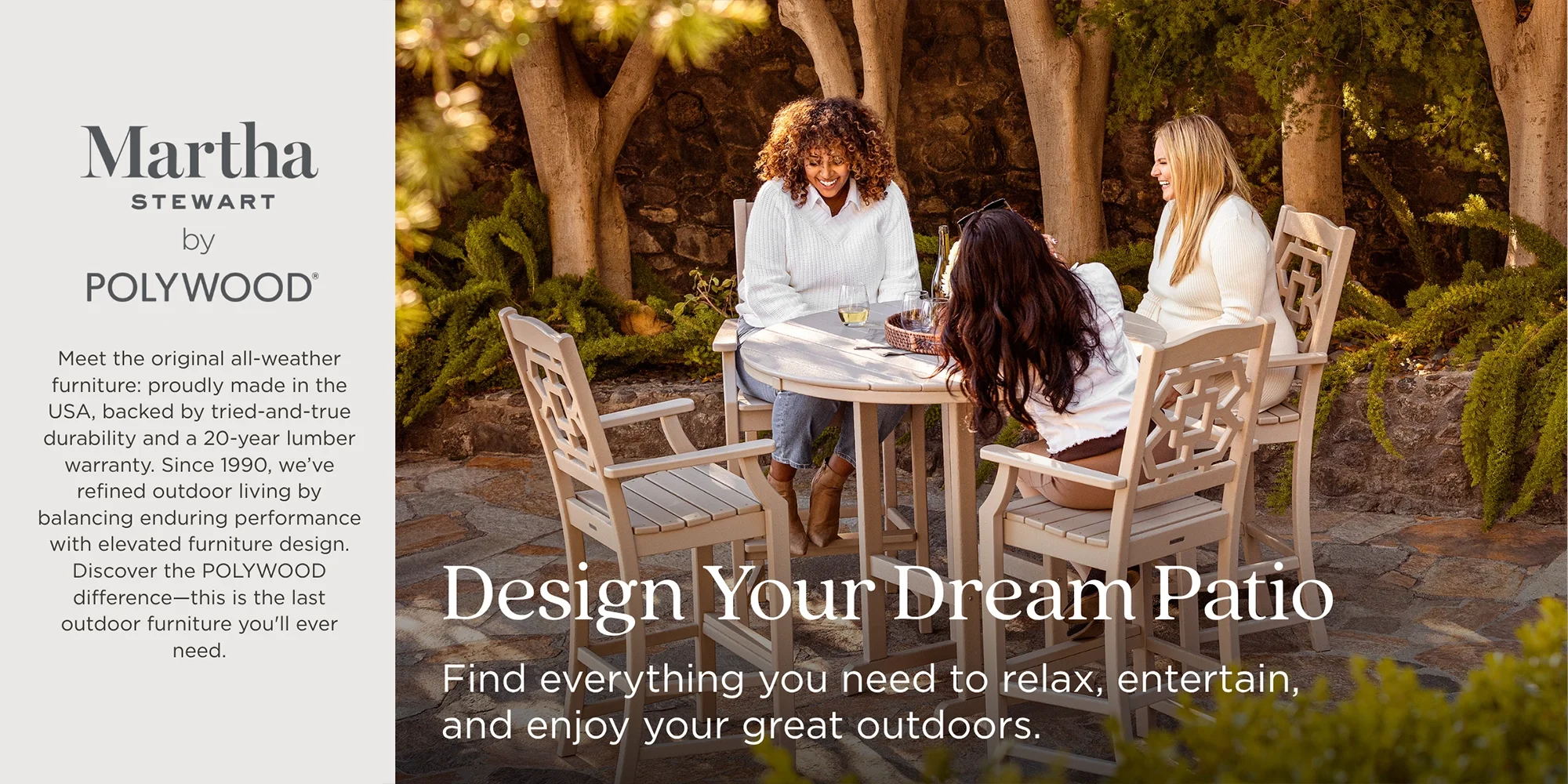
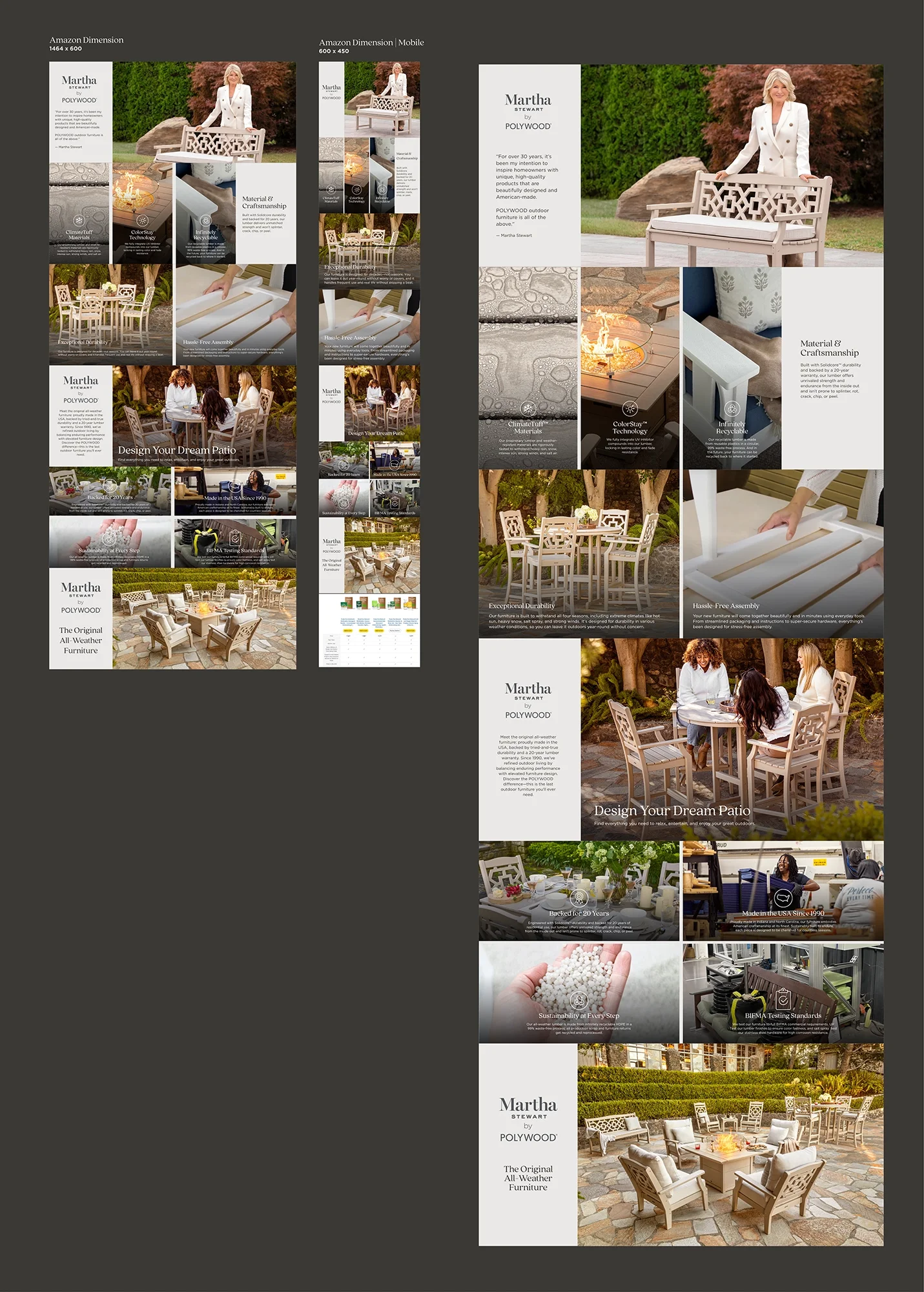
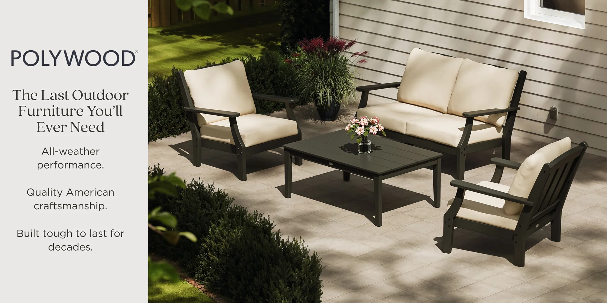
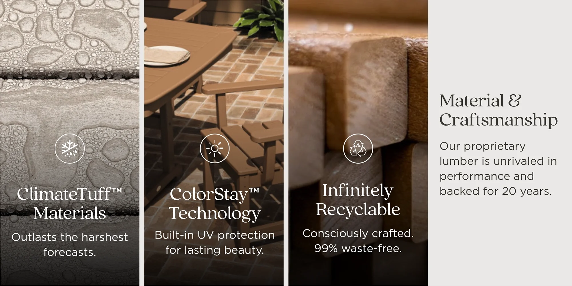
POLYWOOD makes outdoor furniture — Adirondack chairs, deep seating, dining sets, plus a licensed Martha Stewart collection — and the catalog is enormous because nearly every product comes in a range of colors and sizes. Working through Rize, the e-commerce agency that brought me in, the job was to build out their Amazon presence: primary images, full image stacks, A+ content, and brand-story pieces across the line. The real challenge wasn't designing one beautiful product card. It was designing a system that could hold up across hundreds of them without falling apart or going off-brand.
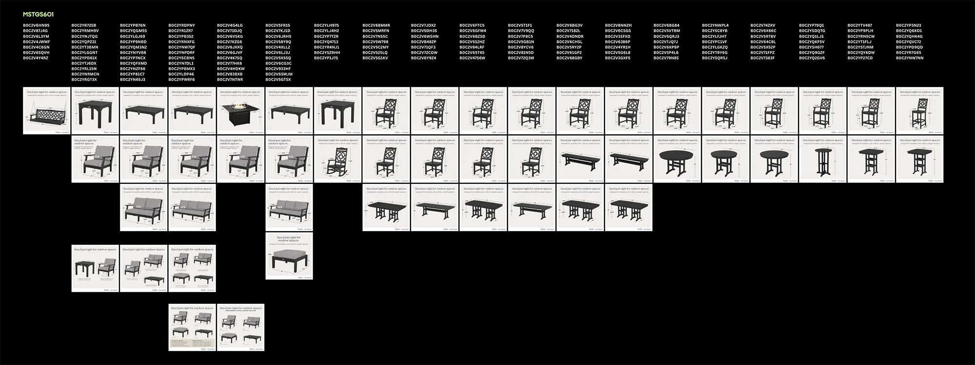
The approach we landed on early became the backbone of the whole project: get one variation of each product into a genuinely strong place, then reapply that template across all the other variants and colors.
That sounds simple, but it's where the discipline lives. A design that works for a single hero shot often breaks the moment you swap in a different color, a missing lifestyle photo, or a set that includes two chairs and a table. So the template had to be built to flex from the start — consistent layout, consistent brand cues, with room for the pieces that change per SKU (the product photo, the dimensions, the variant name) to drop in cleanly. Build the engine once, and suddenly 288 ASINs is a workflow instead of a panic.
We started with the Black Adirondack Chair as the proof of concept, got the primary image and full stack dialed in, then used it as the model the rest of the catalog could follow.
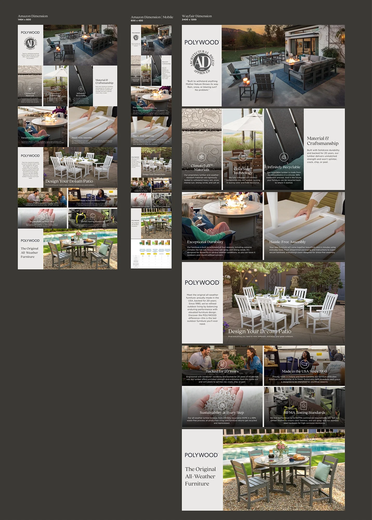
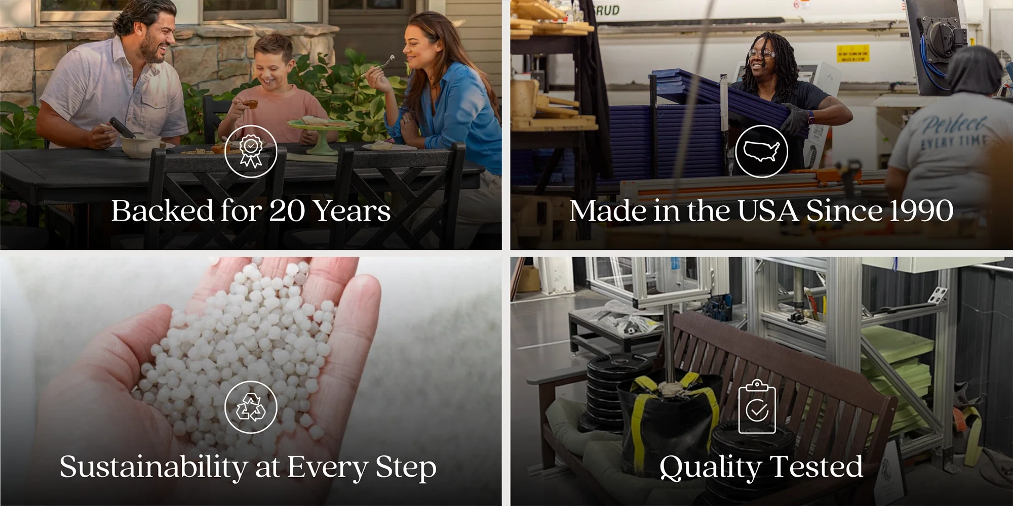
A lot of this project was solving for the unglamorous realities of selling on Amazon — the stuff that never shows up in a pretty mockup but absolutely determines whether the work goes live.
The primary image had to read like it was on real packaging to clear Amazon's requirements, which meant a lot of iterating on the backercard look until it passed. Similar products needed to be visually distinguishable from each other on the primary image, so a shopper (and the algorithm) could tell one Adirondack variation from the next. Trademarks had to land in the right spots. Fonts had to match what already lived in POLYWOOD's print catalog — I pulled their Quincy typeface straight from it so the Amazon work felt continuous with everything else. And when the Martha Stewart collection came in with its own brand guidelines, we matched how POLYWOOD itself had handled that collaboration in print rather than inventing a new approach.
None of these are glamorous. All of them are the difference between creative that looks nice in a deck and creative that actually ships.
This was also a project with a lot of stakeholders, and I mean that affectionately. Feedback would come in, then come in again from someone higher up, then once more from someone higher up than that — the kind of process where the right move is to stay loose, keep everything fully editable, and treat each round as one more pass toward the version everyone can sign off on.
To keep that from turning into chaos, we ran almost everything through Canva so Rize and the POLYWOOD team could comment directly and we could turn versions around fast. Some pieces went many rounds (the AD-seal lifestyle image became a running quest to pin down exactly what was wanted), but the shared workspace meant the back-and-forth stayed organized instead of buried in email. At one point the main contact clarified that some of his sharpest "feedback" was really just him collecting inspiration and crossing his T's — which, once known, made the whole rhythm easier to read.
It also became impossible not to notice the product out in the wild. About halfway through, I realized my own apartment complex has POLYWOOD Adirondack chairs. Hard to design something all day and then go sit in it on the way home.
POLYWOOD came away with a scalable Amazon creative system — a proven template for primary images, image stacks, and A+ content that holds up across the core catalog and the Martha Stewart line, with the brand staying consistent whether you're looking at one chair or scrolling through a hundred variants.
The deliverable was hundreds of product images. The actual work was building something repeatable underneath them — so a catalog that could have been overwhelming became something organized, on-brand, and built to keep growing as new products roll in.
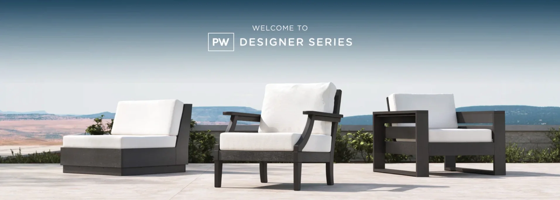
One Strong Template, Hundreds of Variants
Amazon creative at scale for POLYWOOD · 2026
More from Inflow
Like this project? If this is the kind of work you want for your own business, let's talk. Email me at → contact.inflowdesigns@gmail.com