The Long Way to the Right Answer
A brand identity for Anchor Behavioral Health Services · 2025
Kelvin came to me building something from scratch — an Intensive Outpatient Program for behavioral health, mental health and substance use, designed to grow across multiple states. He had the name, Anchor Behavioral Health Services, a freshly filed LLC, and a few AI-generated logo drafts he'd whipped up to feel out a direction. What he wanted was someone to take that raw start and turn it into a real, scalable brand.
He also told me, pretty much in his first message, that he gets indecisive when he's staring at strong options. And honestly? Best thing he could've said. A client who's willing to sit with the work, poll his friends, and admit when he hasn't landed yet is a client who walks away with a brand he actually believes in — instead of one he picked at 11pm just to make the designer stop emailing him. This is the story of taking the scenic route to exactly the right answer.

The name did a lot of the early lifting, bless it. An anchor is a gift of a metaphor for behavioral health — stability, grounding, the thing you hold onto when the seas get rough. Kelvin had already filed the LLC under it, so the anchor was STAYING. The only question was what kind of anchor we were dealing with.
For round one I sent three directions: a classic, grounded anchor in trustworthy blues; a modern, abstract one built from geometric blocks; and an elevated, minimal version with a bold orange that intentionally ran screaming from the blues-and-greens that every other clinic in this space defaults to.

Here's the part where most case studies quietly pretend the client took one look, pointed at a logo, and rode off into the sunset. Reader, that is not what happened. And the honest version is way better anyway.
Kelvin loved things in all three. Drawn to the classic clarity of Concept 1. Also drawn to the fresh, human feel of Concept 2. He showed them to his peers, who promptly split down the middle and helped exactly nobody. So we rolled up our sleeves on Concept 2, and I explored FIFTEEN variations of the abstract anchor — fifteen! — hunting for the one where the shape actually reads as an anchor without losing its modern edge.
Then he slept on it and came back leaning toward Concept 3. The minimal one. The other one.
But — and this is the important bit — it wasn't a flip-flop for sport. He'd figured out that the thing he was really responding to wasn't abstraction, it was craft. He pointed at the Lucid mark in my portfolio and basically said "that — give me that feeling." Minimal and bold, but with a subtle creative detail or two that make it feel considered instead of like clip art. Which is an genuinely useful thing for a client to be able to articulate, and it reframed the whole project.
So I built Concept 3 out with soft organic curves, texture, and a warmer treatment, because a minimal mark left totally bare tends to feel less "high-end brand" and more "spreadsheet."
None of these loops were wasted, for the record. Every single one sharpened what Anchor needed to be. My job through all of it wasn't to herd him toward a finish line — it was to keep the whole thing feeling calm and unhurried, so he could find his own conviction instead of borrowing mine.

The turning point didn't come from a logo file at all. It came from Kelvin spending time in Arizona, in the actual community Anchor was going to serve.
He came back and told me he kept circling back to one of the EARLY green-toned anchor directions — the grounded, approachable one we'd half-wandered past weeks earlier. After seeing the place and the people in person, that warmer, community-rooted feel was the one that clicked. And this time? Zero hedging. "No more switch-ups from my end." He'd found it. Cue the choir.
That's the quiet magic of a client who takes their time. When they finally commit, they COMMIT — because the answer is genuinely theirs and not something they got talked into.
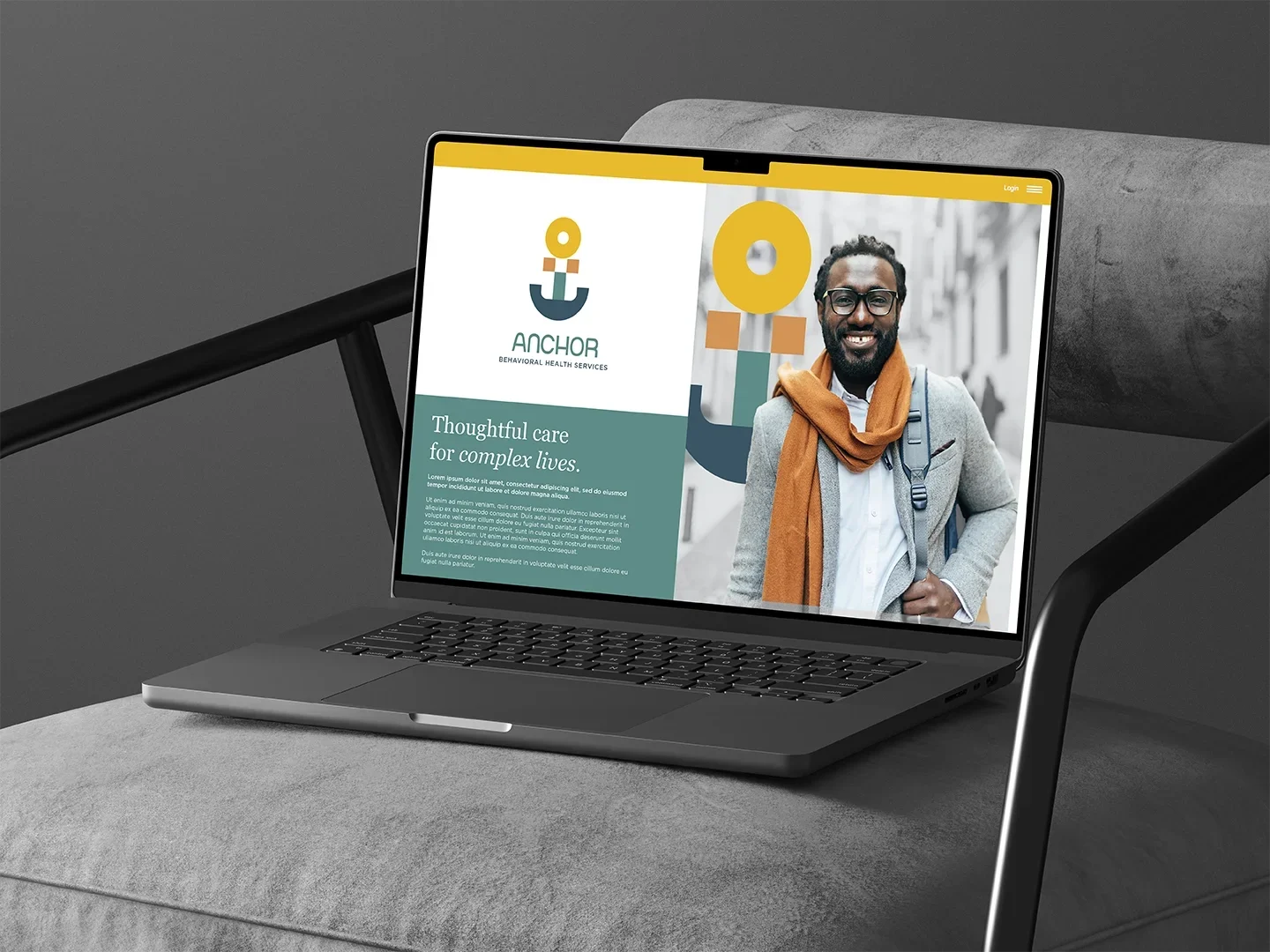
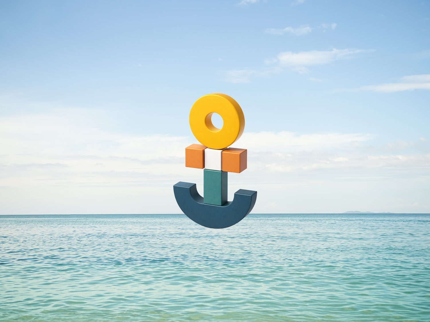
The final mark is an anchor built from simple, friendly shapes — a circle, a couple of blocks, a curved base — stacked into something balanced but ever-so-slightly alive, like it's holding steady against a bit of motion. For a brand built to serve people whose lives can feel unsteady, that "wobbly but grounded" energy felt exactly right. (Sometimes the metaphor just hands itself to you and you say thank you.)
The palette landed on a grounded teal, a warm orange, and a bright, optimistic yellow — confident, human, and a hard left turn away from the ocean of clinical blues this category loves to drown in. We paired a rounded, approachable display face with Gotham for the structured, credible supporting type — splitting the difference between the two crowds Anchor has to win over at once: families who need to feel welcomed, and referral partners who need to trust it on sight.
Then it rolled out across the whole system — primary and tactile logo treatments, a 3D version for text-heavy layouts, business cards, signage, website, social, the works. All of it living under a line that nails the entire point: thoughtful care for complex lives.
If you're starting something and you don't yet know exactly what you want it to look like — good. Genuinely. That is a perfectly fine place to begin. The right brand almost never shows up in round one, and being decisive on day one matters a whole lot less than being honest about what's resonating and willing to sit with it until it clicks into place.
My whole job is to make that feel calm instead of terrifying — to take a pile of strong options and narrow them into one clear direction without rushing you, and to still cheerfully be here resizing your Facebook header two months after the logo's "done." Anchor took the long way to its answer. It's a better brand for it, and Kelvin owns every last pixel.
More from Inflow
Like this project? If this is the kind of work you want for your own business, let's talk. Email me at → contact.inflowdesigns@gmail.com