The Copy Comes First
A website for Blooming Neuropsychology · 2026
Melissa already had the most important part figured out: the heart behind the practice. Blooming Neuropsychology is a pediatric neuropsychology practice built around helping kids and families understand how a child's brain actually works — thoughtful, warm, and deeply careful about how it talks about the children it serves. What she wanted was a website that lived up to that.
And the thing about a site like this is that it can't start with the visuals. A parent landing on the homepage is often worried, a little overwhelmed, and not sure whether an evaluation is even the right next step. So before a single color or graphic mattered, the words and the order they came in had to do the real work — moving a family from "I'm not sure about this" to "okay, I think this is the right place."
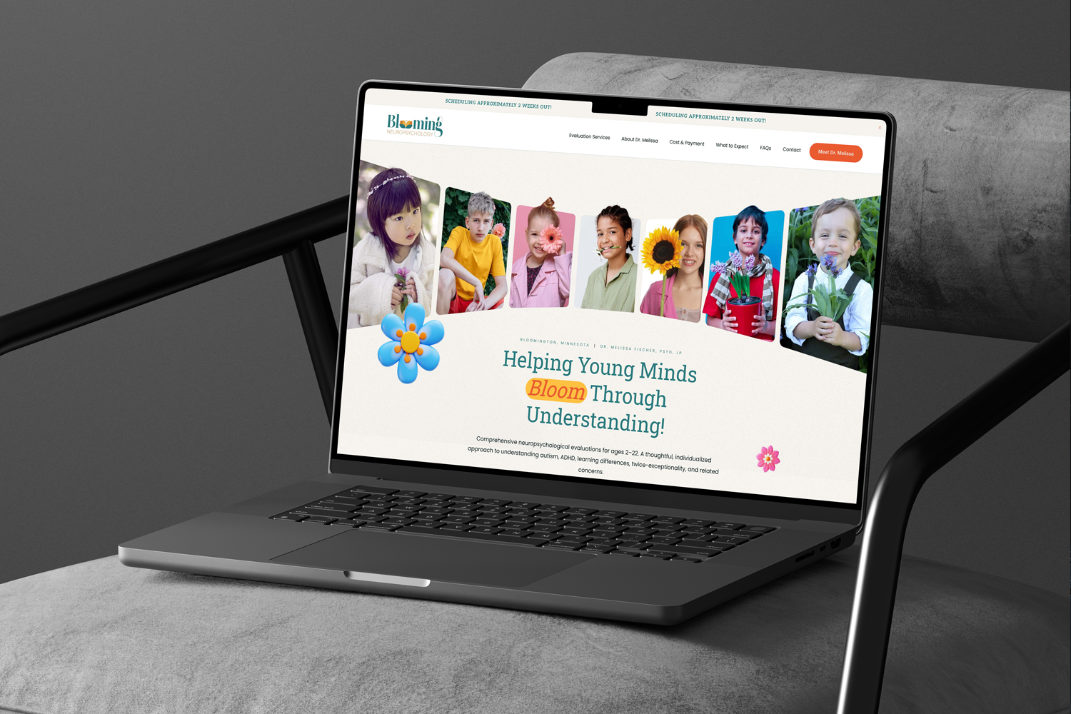
The homepage was built around an emotional arc rather than a list of services.
It opens with reassurance. Then it reflects the kind of concerns families actually arrive with, in plain language, so a parent feels seen before anything technical shows up. Then the evaluations, explained simply. Then what makes Melissa's approach hers. Then the practical stuff — process, cost, next steps. The whole page is designed to carry someone from uncertainty to understanding to trust, and only then to "reach out," once their questions have actually been answered.
My favorite parts ended up being the sections at the end of each evaluation page, where a child's challenges get reframed as strengths. That reframing is the entire spirit of the practice, and getting it into the copy mattered more than anything decorative could.
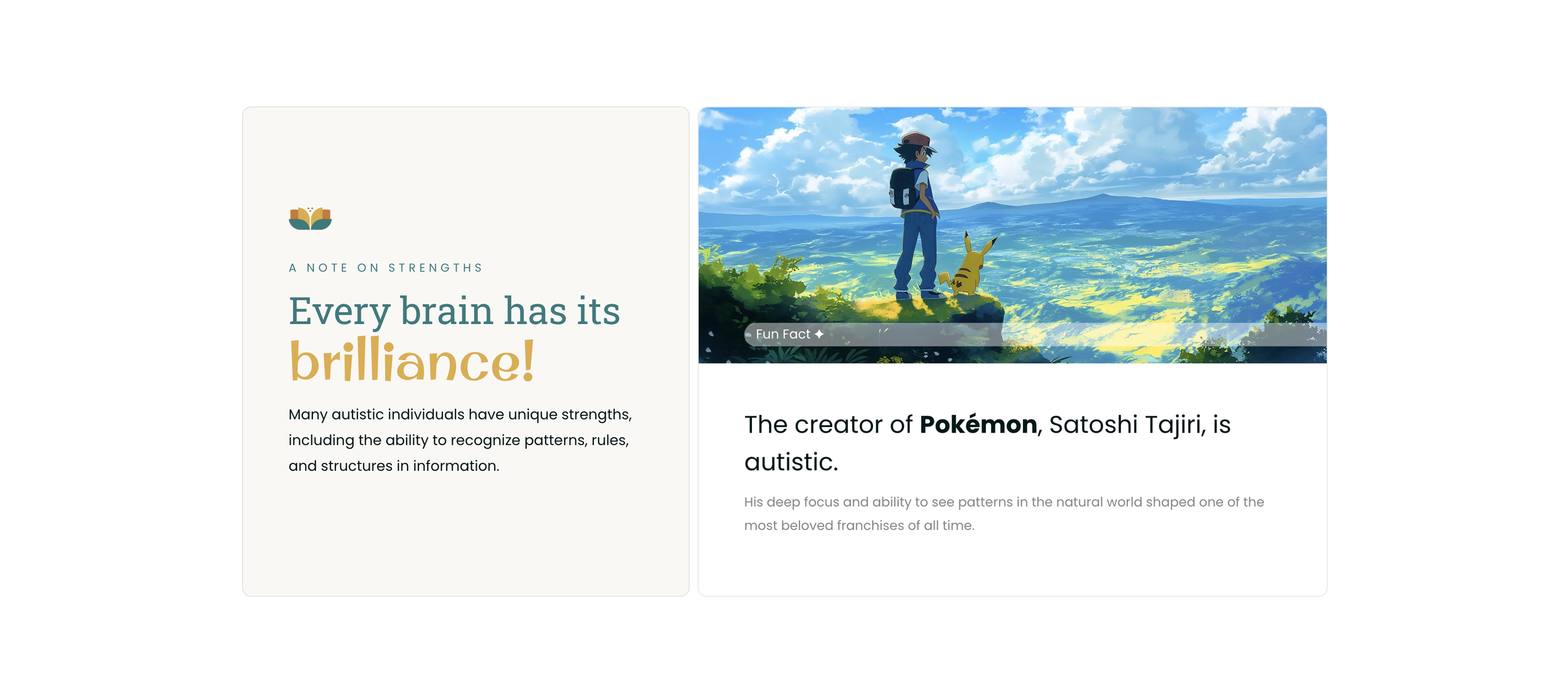
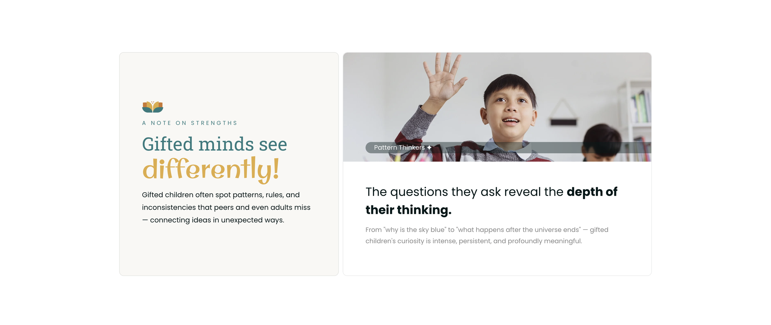
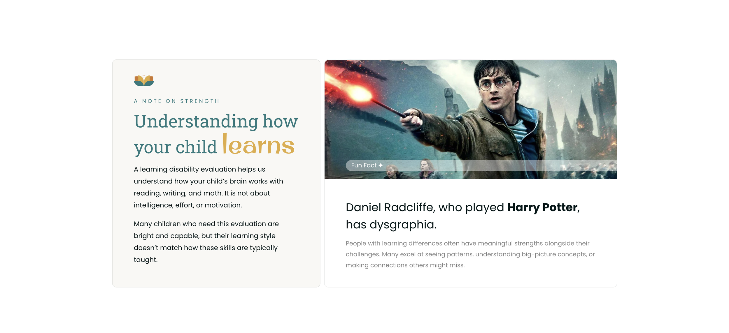
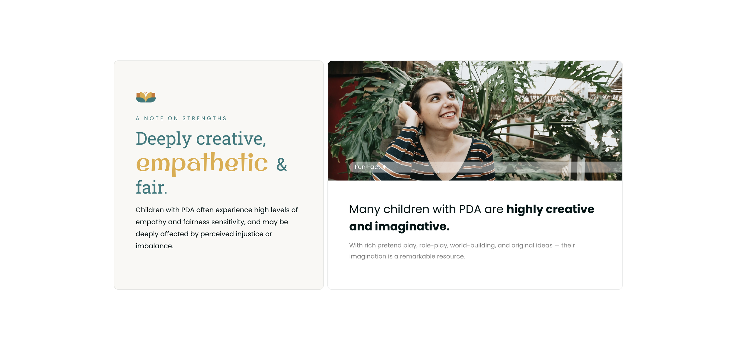
I fell in love with these sections at the end of each evaluation service page — reframing challenges as strengths and helping families see their child through a compassionate, empowering lens.
A lot of this project was writing, and writing for a clinically expert client means the most useful thing I can do is listen carefully and get the language exactly right.
Melissa caught things I wouldn't have. We softened a line calling ADHD a "superpower," because that frames it in a way that isn't realistic or fair to the families living it. We swapped out a puzzle-piece image on the autism page, since the autistic community has largely moved away from that symbol. We reworded the PDA section so it spoke to the "why" behind a child's struggles rather than leaning on clinical-sounding labels. None of these were design notes — they were care notes, and they're the difference between a site that looks right and one that actually reflects how a practice thinks.
There was also a tightrope walk on the language itself. A word Melissa loved, "understanding," had a history with a former colleague's practice, so we found phrasing that kept the meaning without stepping on anyone. Small thing, but it's the kind of thing that matters when you're launching a solo practice on good terms with the people you left.


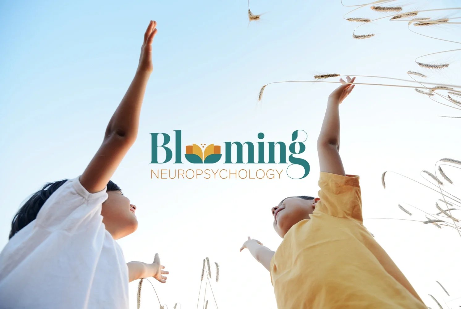
Visually, the site had to sit in a very specific spot: warm but not childish, playful but not cartoonish, professional but not cold.
Getting there meant pulling some things back. A bright orange-red section got softened. A playful font got swapped for something cleaner and easier to read. Some loose, scribble-style marks came out in favor of details that felt calmer and more polished. In place of the usual floral watercolor clichés, we brought in soft, rounded 3D flowers that gently rotate as you scroll — a small, warm detail that adds life without tipping into cute.
The copy got the same treatment as the design: parent-friendly and natural, while keeping the important specifics accurate — evaluation timelines, feedback sessions, out-of-network cost language, cancellation policies. The result reads like the practice itself: bright, caring, organized, and easy to follow.
SEO was part of this from the start, but the goal was never to cram in keywords. It was to help the right families find the site while keeping the writing human.
That meant a search-friendly structure, clear titles and meta descriptions, proper heading hierarchy, optimized images, and language that matches how families in the Twin Cities actually search for a pediatric neuropsychological evaluation. Good SEO helps someone find the site. The copy and flow are what help them stay, understand, and decide to reach out.
Blooming's new website gave the practice an online presence that finally matches the care behind it — clearer, warmer, and easier for a worried parent to move through without feeling overwhelmed. It's less a digital brochure and more a calm first conversation, the one that happens before a family ever picks up the phone.
For a practice whose whole purpose is helping families understand their kids, it felt right that the website's real foundation wasn't the design at all. It was getting the words, and the order they arrive in, exactly right.
More from Inflow
Like this project? If this is the kind of work you want for your own business, let's talk. Email me at → contact.inflowdesigns@gmail.com