Making Design & Copy Work for Two Audiences at Once
Website and copywriting for A Walking Vibe · 2026
Darryl came to me with a real problem: A Walking Vibe had figured out how to create immersive wellness experiences. What they hadn't figured out was how to show them to the people who fund them.
The website was living on Shopify—a platform built for transactional stuff, not for communicating experience and movement. And beyond platform, there was a deeper strategic bind: A Walking Vibe's actual value only reveals itself in a room, in real time, with real people. But decision-makers—university administrators, corporate teams, student affairs directors—they need to understand what they're buying before the moment happens.
How do you design for that gap?
Students want to feel that something energetic is happening. Decision-makers want to know what they're buying, whether it works, and how to move forward.
Those instincts don't naturally align.
We solved it through contrast and structure, not compromise.
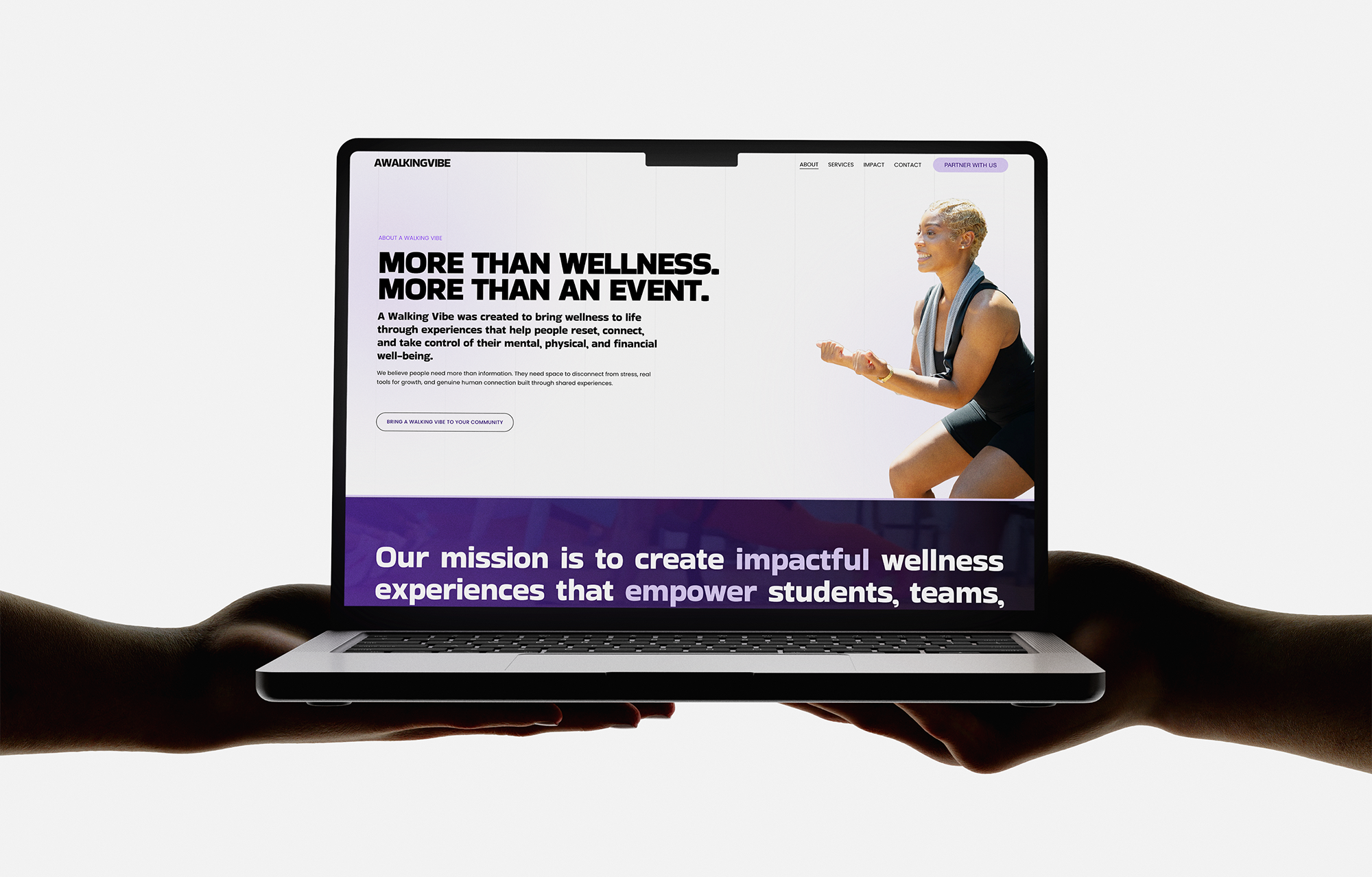
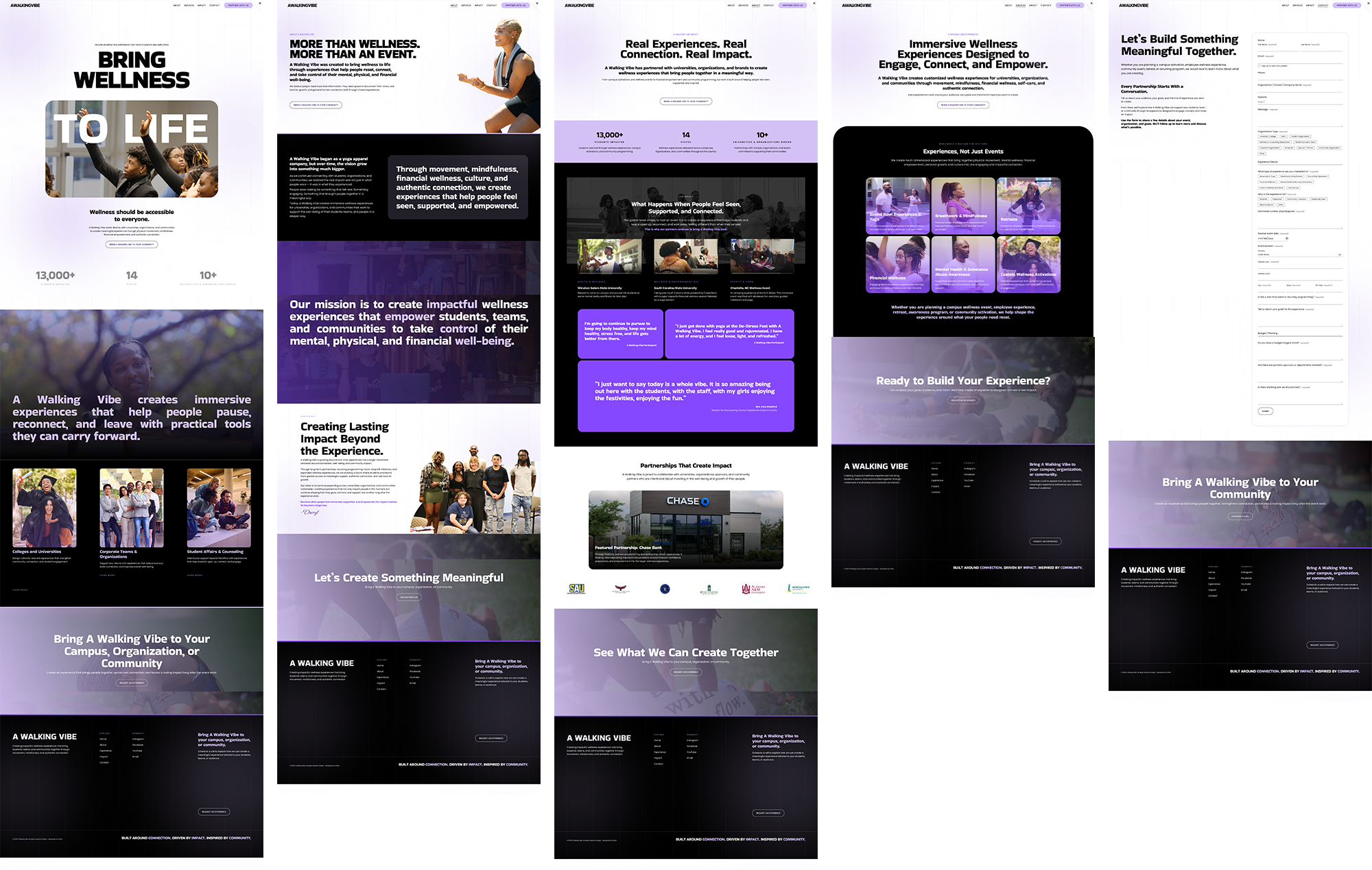
The hero uses oversized black type paired with a rounded image card of real event photography. Overlaid directly on that photo: white text reading "TO LIFE." Poster-like. Bold. But it's also doing three things at once: signals energy immediately, proves the experience is real (not stock imagery), works for both audiences.
From there, the homepage moves: hero → impact stats → dark section with samples → CTA banner. Every transition supports a conversion goal rooted in how different visitors think.
We refined the color palette to introduce lavender as a subtle accent—warm enough to soften the boldness without losing edge. It appears in button states, subtle backgrounds, gradient overlays. Just enough to create cohesion without clutter.
The contact form is intentionally long. Not because we needed all those details, but because the form itself communicates strategy: we're not selling packaged programming; we're designing something custom.

A Walking Vibe doesn't fit standard wellness language. Is it yoga? Breathwork? Mental health support? Financial wellness? The answer is yes to all—but organized around the idea that immersive experiences help people connect.
So the copy had to create the category.
Hero: "A Walking Vibe creates immersive wellness experiences for universities, organizations, and communities through movement, mindfulness, financial wellness, self-care, and authentic connection."
That positioning names the category upfront, lists what's included, and names the outcome. Then it shifts tone based on audience—personal for participants, strategic for decision-makers.
Real event photography was critical. Not because it's pretty, but because it's the only way to prove the experience is genuine. A stock photo of yoga proves nothing. A candid photo of real students in breathwork proves it works.
When you're designing for something fundamentally experiential—something that only makes sense in the moment—the design work isn't about making it look good. It's designing the journey from curiosity to belief to action.
For A Walking Vibe, that meant bold typography, real photography, intentional contrast, long-form customization signals, and positioning copy that speaks to decision-makers without losing energy.
Design and copy didn't just support each other. They were the same decision.
More from Inflow
Like this project? If this is the kind of work you want for your own business, let's talk. Email me at → contact.inflowdesigns@gmail.com