Room for Everything They'd Become
A website for HH & Co. · 2025
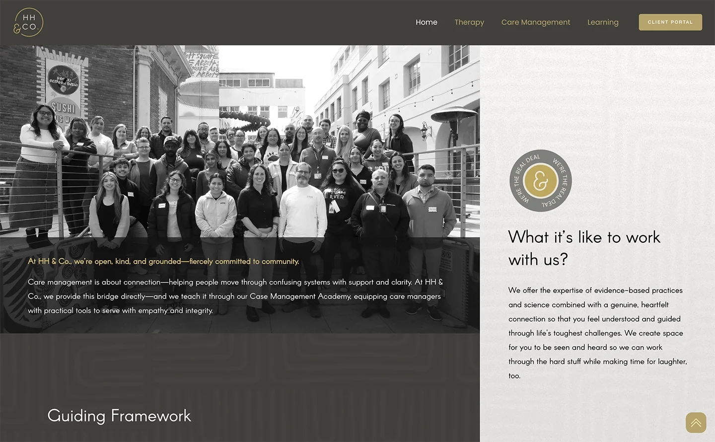
HH&CO hadn't outgrown its website because anything was broken. It had outgrown it the good way — by growing. The practice kept adding and refining until it was doing a lot of connected-but-distinct things at once: therapy, consulting, executive coaching, applied learning, and a brand-new care management service getting ready to launch.
All of it mattered. All of it was related. But on the old site, it was hard to tell where one thing ended and the next began. So the real goal was never "make it look newer." It was to make HH&CO easier to understand — which is a different, harder job.
Holly, Isabel, and Juni were clear from the start about the core issue: HH&CO had several "wings," and the site wasn't making the difference between them feel clear.
Clinical clients needed a simple path to therapy and scheduling. Consulting work needed to be visible instead of buried. The team page needed room for more people without turning into an endless scroll. The new care management service had to be built quietly in the background, ready to switch on. The whole thing needed to move onto the current version of Squarespace, with cleaner structure and better SEO. And — this part came through loud and clear — a lot less grey.
So a "website refresh" quickly turned into something more like organizing a full, thoughtful house. The rooms were all there already. They just needed better doors, clearer labels, and a layout that helped people know where to go.
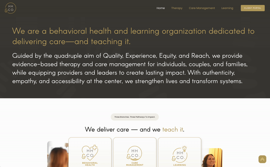
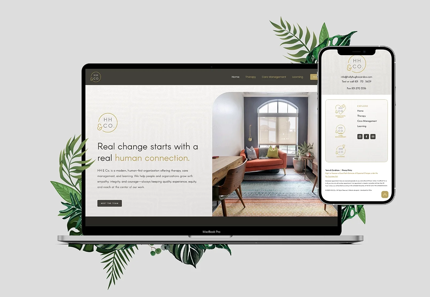
The central challenge was the homepage. It had to introduce HH&CO's three main areas — Modern Therapy, Care Management, and Applied Learning — so each could stand on its own while still feeling like part of one world.
At one point we explored a more interactive, horizontal-scrolling layout for those three. It looked great, but the content had real weight to it, and on smaller screens it started getting cramped and cutting off. So we pulled it back to something simpler and easier to scan, and let the full depth live on each dedicated page where there was room to read. The flashier version would have made the homepage perform a little; the simpler one actually did the job. That trade — clearer over louder — ended up guiding a lot of the project.
There was a lot of movement behind the scenes here, and it never slowed things down. Isabel got the project off the ground, then handed it to Holly and Juni as her time with HH&CO wrapped up. The team gathered photos, refined service language, and kept thinking through what the site needed to be.
That felt fitting, honestly. HH&CO's work is relational and collaborative, so the process became relational and collaborative too — thoughtful notes, working sessions, and the occasional call that started on one topic and happily wandered through ten. My job through all of it was to keep turning that input into structure: cleaner pages, stronger hierarchy, better navigation, and a site that could hold the full shape of the organization without feeling chaotic.
Then came launch — and the part of building a website that scares people off entirely.
Moving a domain from one platform to another, untangling DNS settings, waiting on a transfer that sits at "in progress" for days, chasing a placeholder page that keeps showing after everything's supposedly connected, clearing caches, sorting out an old subscription so nobody double-pays. I've had people tell me they put off having a website for years purely to avoid this headache.
For HH&CO, that whole stretch was mine to manage. When the GoDaddy-to-Squarespace transfer got frustrating, I stepped in and worked the steps with the team and Squarespace support directly. When a GoDaddy placeholder kept showing after the domain was connected, we chased it down until the live site loaded correctly — which, in the end, came down to clearing some cached browser data. It took a couple of weeks of patient back-and-forth, but it got done, and it got done without anyone on their side having to become a DNS expert.
That's the point I care about: the domain stuff is real, and it's annoying, but it's not something a client should have to lose sleep over. It's the part I take off their plate.
HH&CO ended up with a site that finally has room for the organization they'd become. Modern Therapy, Care Management, and Applied Learning each have a clear place to live. The brand still feels bold and human — and a lot less grey — but the structure underneath it is far easier to follow, on a foundation the team can keep building on.
More than that, the finished site just feels like them: layered, collaborative, thoughtful, a little lively. A website for a team whose work doesn't fit neatly into one box — built to give every part of it a clear place to land.
More from Inflow
Like this project? If this is the kind of work you want for your own business, let's talk. Email me at → contact.inflowdesigns@gmail.com