A Logo with a Story Hidden Inside It
Branding for Palim Health · 2026
Dr. Connor and I had already been working together for a while before any of this started. I'd built her therapy practice's website the year before, so by the time she emailed about a rebrand, we were past the getting-to-know-you phase and squarely into the "hey, something's wonky on my site, also — I want to rename my entire practice" phase.
So when she decided to relaunch as Palim Health, she came back to me to design the brand. The name already carried a lot of meaning, and my job was to make it work as a mark.
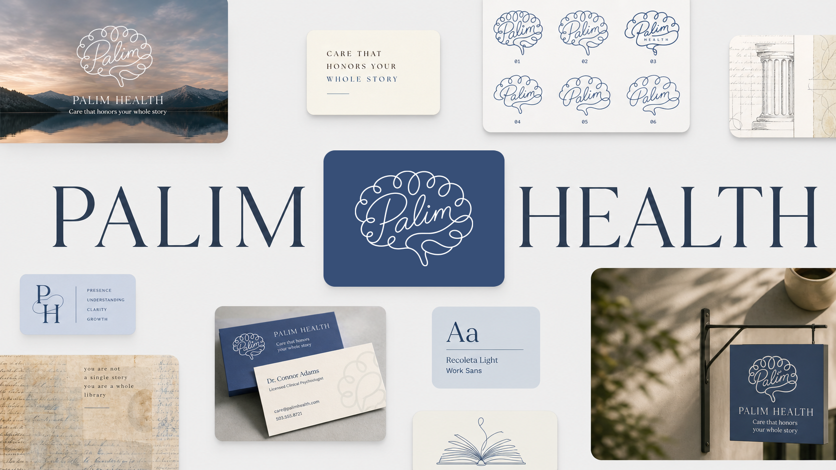
Palim Health takes its name from palimpsest — a manuscript that's been written on, erased, and written on again over time. The earlier writing fades, but traces always remain, shaping whatever comes next.
For Connor, that's a near-perfect metaphor for therapy. You don't erase the past. You come to understand it, integrate it, and start writing new chapters on top of the pages that are already there. It's a genuinely beautiful idea for a practice to be built on, and it gave the whole project its north star.
It also meant the bar was high. When the name is that thoughtful, a generic brain icon simply will not do.
Connor came in with a couple of AI-generated references a friend had made while playing around. One had a really compelling idea — a pencil interacting with a brain — but it had a slight problem, which is that it read less like "writing" and more like the pencil was stabbing the brain. Not quite the calming-therapy energy we were going for.
The second reference had a softer, more layered feeling she loved, but it got visually busy fast. So the challenge sorted itself out pretty clearly: make a mark that feels layered and meaningful without tipping into complicated.
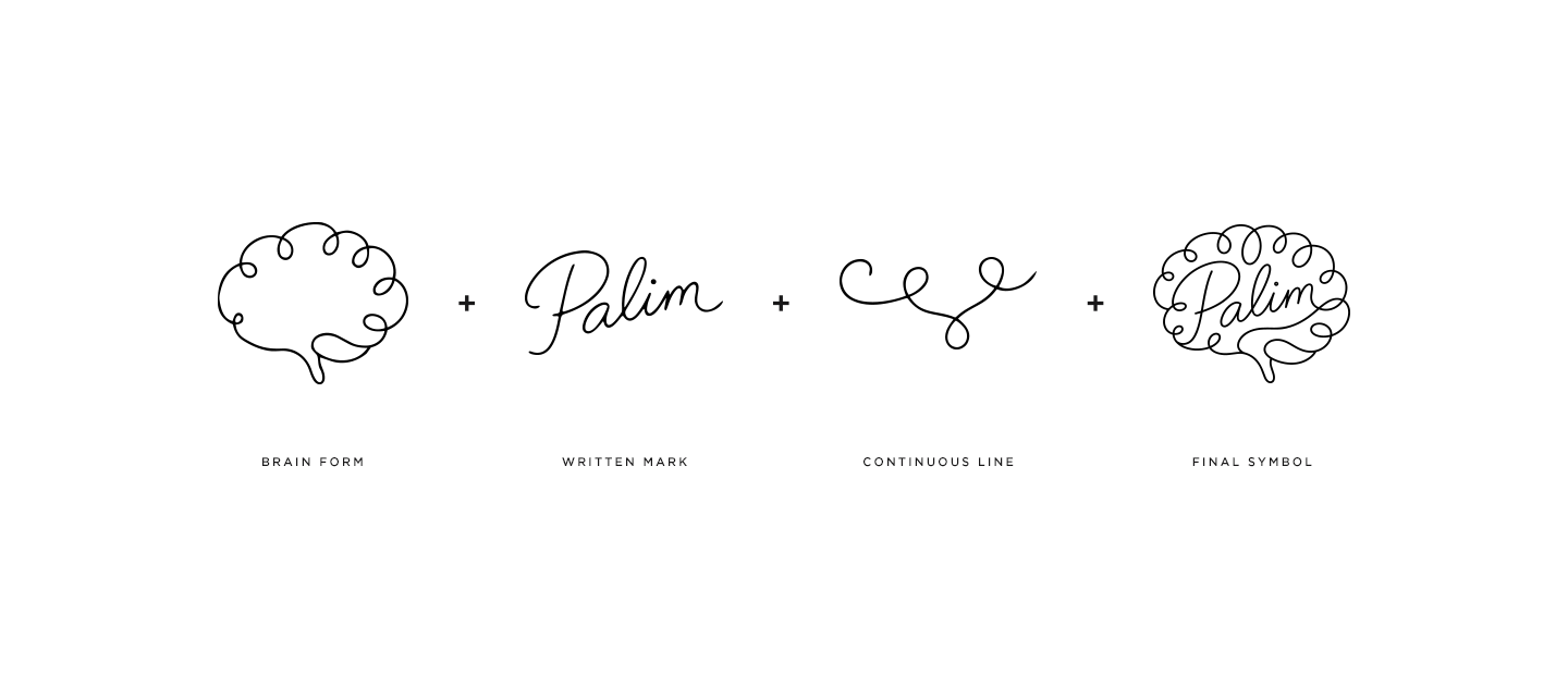
We started simple. A brain. A line. A written mark.
Since Palim is rooted in writing and rewriting, I wanted the logo to feel drawn — human, not machined. So I took the spirit of her friend's original concept and wove the word "Palim" directly into the brain using a single continuous, script-like line.
That was the move. Subtle at first glance — most people just see a brain — but once you catch the hidden word, you can't un-see it, and it becomes the whole thing. Not obvious, not clinical, not a stock therapy logo. A small hidden story tucked inside the mark, which felt exactly right for a practice named after hidden layers of writing.
Here's the part where I tell on myself a little: the first version was great, but the loops were a touch cartoonish. Connor saw it too, and asked — very reasonably — if we could see it slightly less doodly.
So we went looking for the sweet spot. I ran a round getting progressively "less-doodly" while keeping the script-like soul of it. Then a round exploring more abstract brain-from-organic-shapes directions. Then a round zeroing in on the in-between zone, somewhere between the playful original and the refined cleanup.
We both kept circling back to nearly the same place, which is usually the sign you've found it. The winner kept the handwritten character that honors the palimpsest idea, but pulled it back just enough to feel refined and professional rather than overly sweet. Three rounds of tuning one continuous line — and worth every pass.
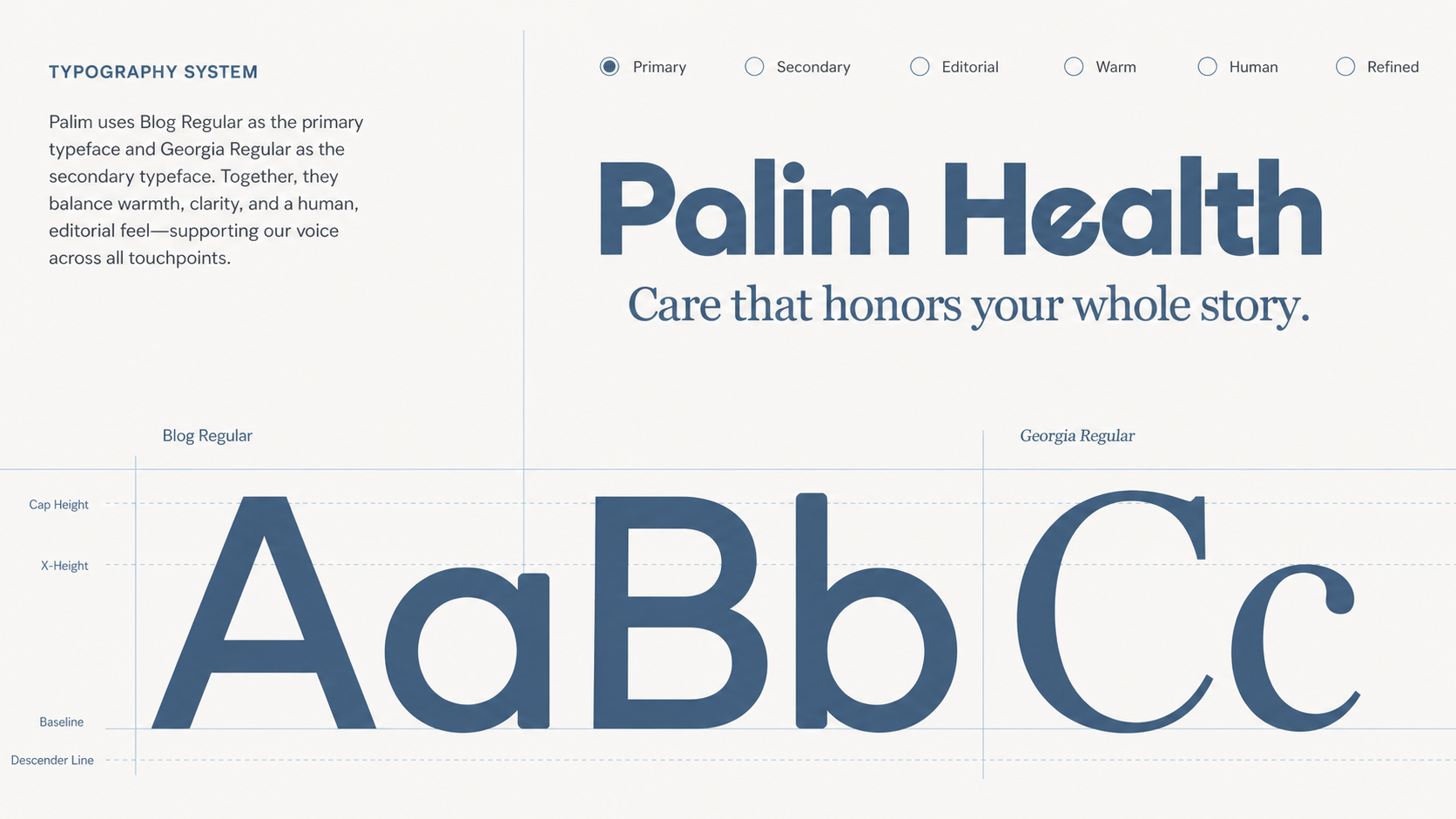
For the wordmark I paired the logo with three type directions: one matching her existing site, one cleaner and slightly playful, and one script that echoed the linework in the mark.
The middle one won, for both of us. The logo already had a lot of personality baked in, so the type's job wasn't to add more — it was to hold the mark warmly and stay out of its way. Enough warmth to support it, enough clarity to keep the whole identity feeling grounded and professional.


A logo's only really done once it lives in the real world, so we took Palim onto business cards and bookmarks. And yes — bookmarks, for a practice named after a manuscript. When Connor first mentioned them she said "based on the practice name, I think you'll get why," and reader, I got why immediately. Some brand extensions you have to invent; this one was sitting right there.
The cards got the full treatment — premium matte stock, a raised gloss logo, a tucked-in explanation of the name for the inevitable "wait, what's Palim mean?" conversations. The project also quietly turned into a small team rollout as Connor's practice grew, including one psychiatrist who'd been very slow to commit — right up until Connor emailed me that the hire was stalled, then emailed back a few hours later that she'd just confirmed haha.
The final Palim Health mark is a single continuous line that forms both a brain and a hidden word. Personal without being sentimental. Soft without being fragile. Thoughtful without getting complicated.
That balance is the point, because Palim Health isn't about starting over from a blank page. It's about honoring what's already there — the experiences and stories that shape a person — while making room to write something new. The logo ended up being a tiny version of that whole philosophy: a story written inside a story.

The best design work tends to happen inside a relationship, not a transaction. Palim exists because Connor and I had already built something together, and trusted each other enough to take on something bigger. I'm not the designer who hands over files and vanishes — I'm the one who's still here for the rebrand, the business cards, the "can you make this QR code dark blue instead of black," and whatever comes after that.
A logo with a story hidden inside it, for a designer-client relationship that keeps writing new chapters of its own. Which, for a practice named Palim, feels just about perfect.
More from Inflow
Like this project? If this is the kind of work you want for your own business, let's talk. Email me at → contact.inflowdesigns@gmail.com