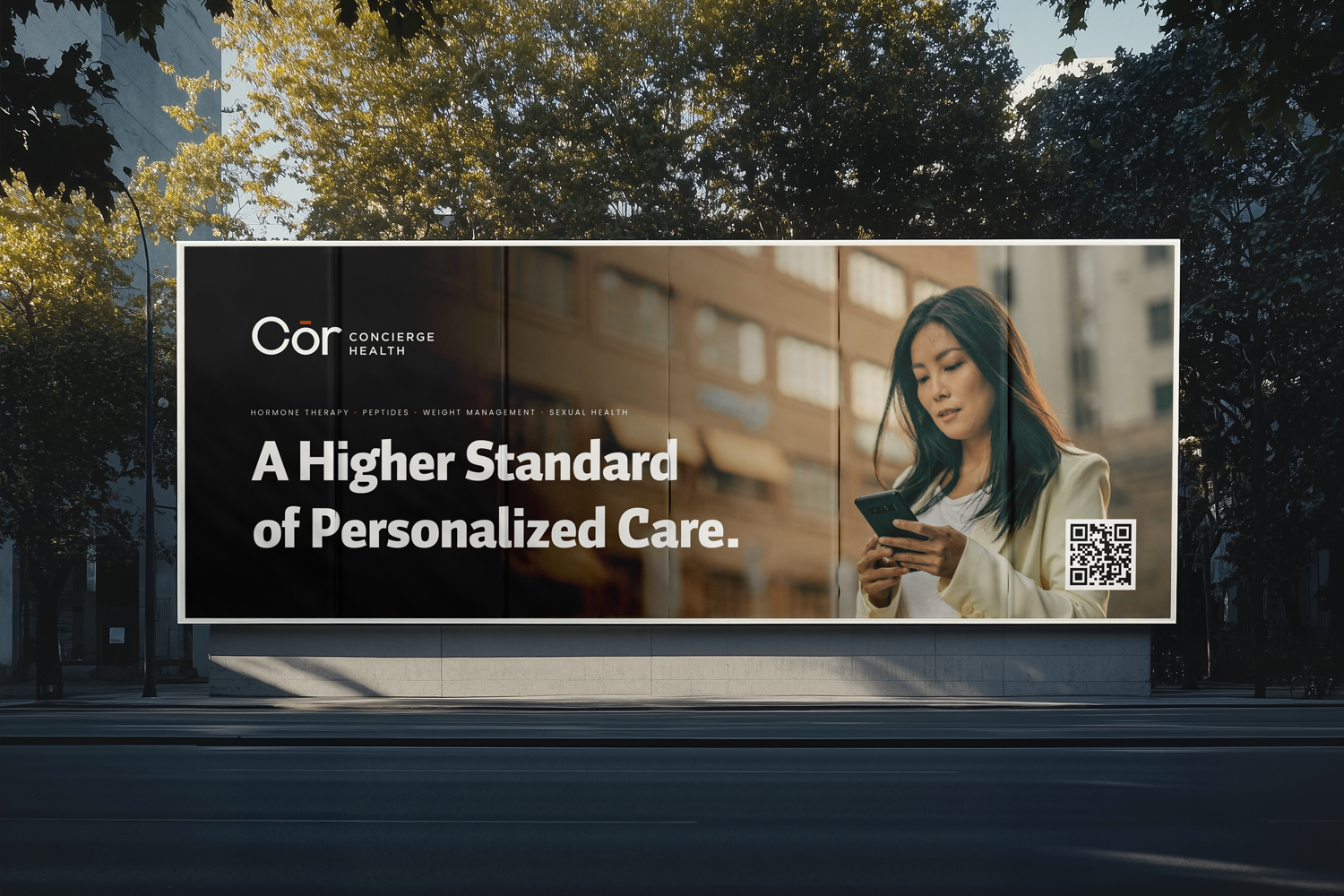
Cōr
Concierge Health · Branding, Wordmark, Visual System · 2026
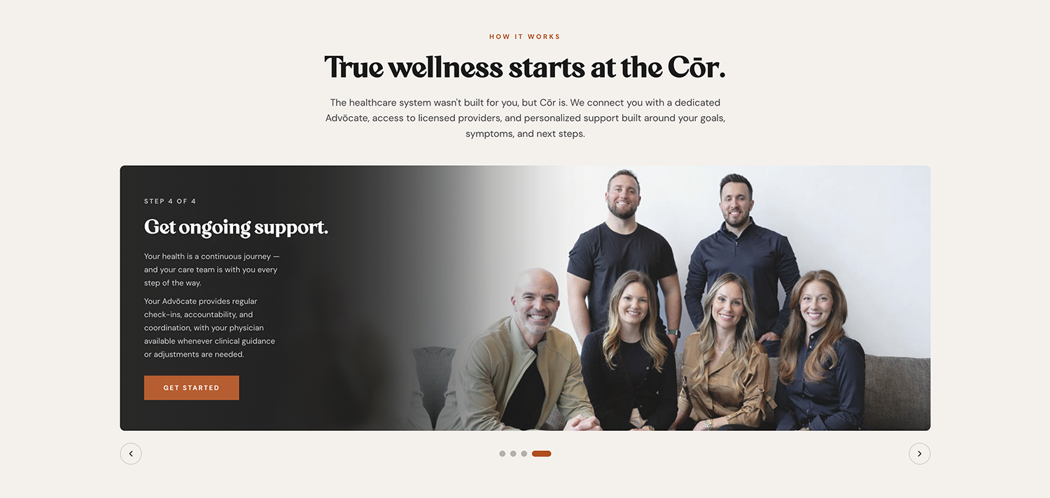
Britney called from her Michigan kitchen on a January night — dog losing his mind in the background, a two-and-a-half-year-old just put to bed who wasn't sleepy. I picked up in Bangkok, twelve hours ahead. She'd started a new job the day before — employee one at a precision medicine startup called Cōr, building a concierge layer between patients and physicians in a category that was getting more crowded by the week. She had a working color palette, a rough idea of what the logo could be, and a launch date of February 1st. That gave us about ten days. Nine, really, since I was on the other side of the world.
The conversation that day covered a lot. Hims and Hers and Function Health, and how Cōr needed to feel different from all of them. A target audience that somehow had to include menopausal women, men in their twenties chasing optimization, executives, and blue-collar laborers — under one brand, because splitting the company into sub-brands (the easier path, the one Hims and Hers took) wasn't on the table.
Britney's instincts were already good. She'd pulled deep blue and warm orange together, sketched a small heart icon, and started playing with a horizontal line over the "ō" — a macron, tied to ideas of levels, balance, staying in range. The strategic foundation was solid. What she needed was a designer to make it real, and fast.
So I did what any sane and professional design practice owner would do, I rearranged my vacation calendar. The project was too good to pass on.
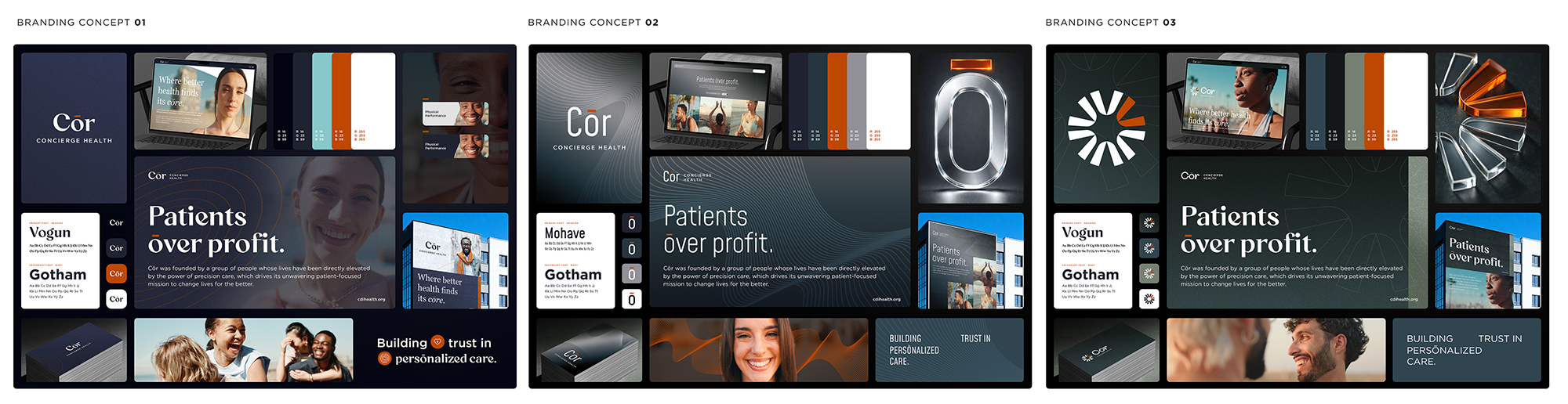
The first round of concepts came back with three directions, and Britney's team gravitated toward two of them — a refined version of her original deep-blue palette, and a third concept that introduced a logomark drawn from the macron itself. The wordmark moved quickly after that. We landed on "Cōr" (lowercase r, not the alternating-cap "CōR" — though I'll admit I went back and forth on that one with her). A small font-mashup in version 1.2 — the "Co" from one option, the "r" from another — turned out to be the right call.
By February 12th, the wordmark was finalized. The soft launch happened the week of February 17th. The hard launch followed on March 2nd. The wordmark performed beautifully — well-received by the team, well-received by the audience they were trying to reach.
The logomark is a different story.
Somewhere around the third round of concepts, Britney sent over a thoughtful note. The team wanted the logomark to be more than a logomark. They were thinking about merch, billboards, lifestyle positioning. They wanted something that could eventually stand on its own the way Nike's swoosh does. The way Adidas's three stripes do. The way Chanel's interlocking C's do.
This is where I had to slow the project down.
The thing about iconic logomarks is that they aren't designed to be iconic. They become iconic. Nike's swoosh wasn't powerful in 1971; it was a $35 design that a college student got paid for after the fact. What makes it carry meaning now is fifty years of repetition. Logomarks gain equity through use, not through cleverness at the design phase. For a brand-new company, leading with the logomark instead of the wordmark is asking a symbol to carry weight it hasn't earned yet. The market hasn't met the name. The name has to do the work first.
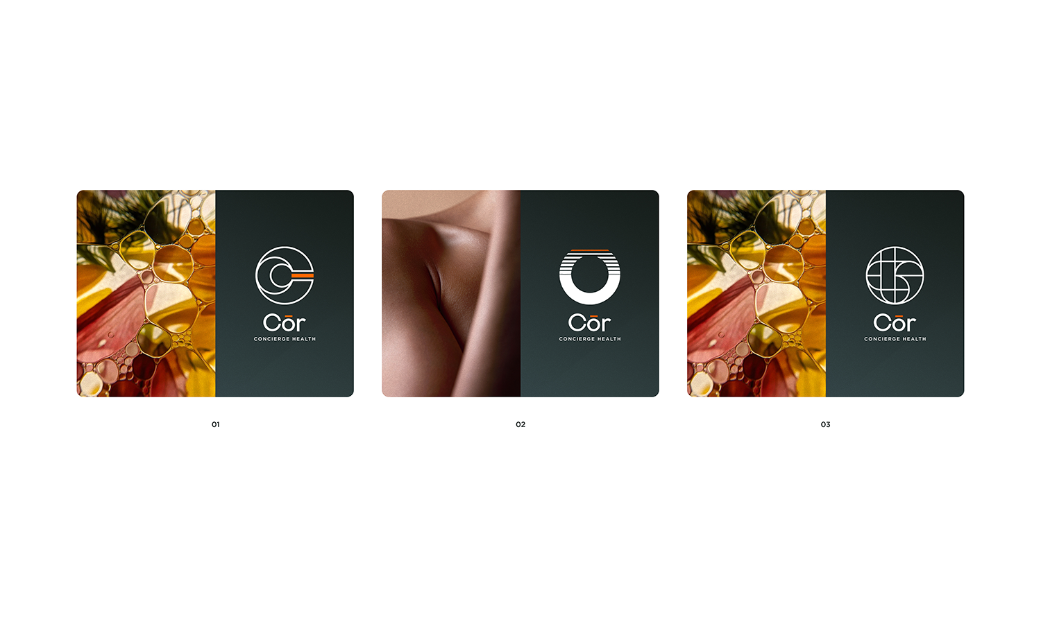
So we shifted the strategy. Cōr launched with the wordmark as the primary identifier — clean, confident, unmistakable in deep blue with the warm accent — and the logomark moved into a longer, more deliberate exploration. As of this writing, the team is still deliberating internally on which direction feels right. That's the correct pace for that piece of the system. A logomark that has to carry a brand for the next twenty years is worth a few more months of getting right.
Some projects are about hitting a deadline. Some are about knowing which parts of the work deserve the deadline and which parts deserve more time. This one was both.

More from Inflow
Like this project? If this is the kind of work you want for your own business, let's talk. Email me at → contact.inflowdesigns@gmail.com