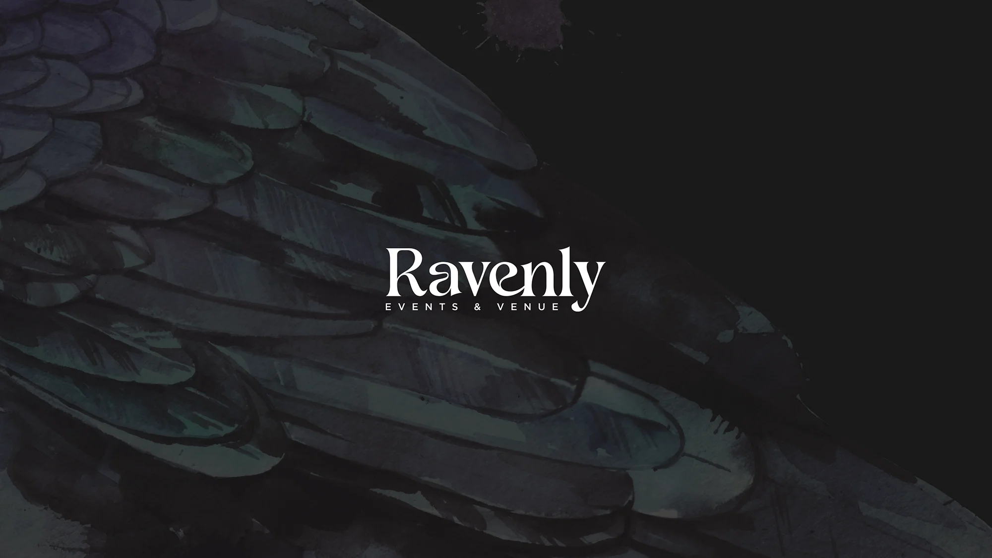
The Brand Became the Anchor
Branding and website for Ravenly Events & Venue · 2026
Amanda came to me with a vision she could feel but hadn't quite assembled yet. She and her husband were buying a beautiful old winery outside St. Louis — vineyards, lakes, a Tuscan-style building someone had once poured their whole heart into — and turning it into an event venue. She knew exactly how it should feel. She just needed help turning that feeling into something real she could build on. As she put it early on, she had the what and the why; it was putting it all together that was bringing on the decision fatigue.
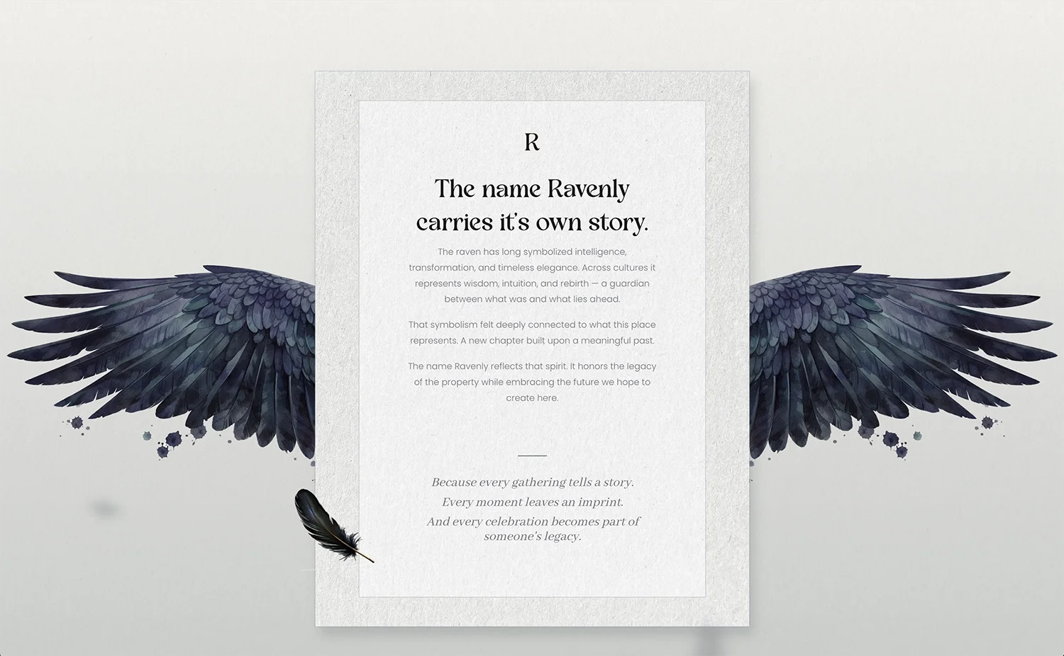
That's a great place to start a brand. And the name already carried the whole thing.
Ravenly comes from the raven — a symbol that's meant something to Amanda for a long time, tied to resilience, transformation, and perspective. Across cultures the raven stands for intelligence, intuition, and rebirth, a kind of guardian at the threshold between what was and what's ahead.
That spirit became the brand's north star, blended with the idea of legacy: a place where, in Amanda's words, moments become legacy. Not just a venue, but a story of renewal and gathering — something lasting she and her husband could be proud to build. Every design decision after that had a clear question to answer: does this feel like that?
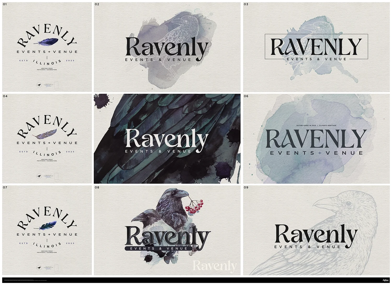
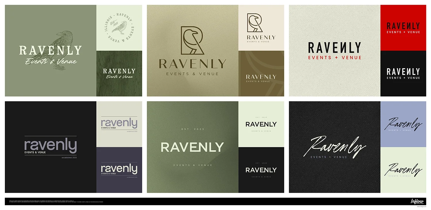
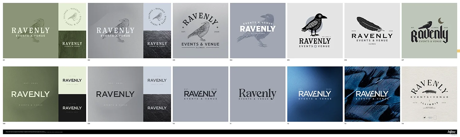
Because the vision was personal, the smartest thing to do was explore widely before committing. The Premium branding package gave us room to do exactly that — six rounds of directions, from heritage engravings to clean architectural wordmarks to bold, cinematic raven treatments, in palettes that moved away from the reds and purples that didn't fit toward a deep, sophisticated "raven blue."
It became a real family affair, too. Amanda's husband loved one of the busier, watch-inspired layouts; her daughter was drawn to a direction that didn't quite fit the brand; Amanda weighed everyone's input and then trusted her own read on what Ravenly needed to be. That kind of honest back-and-forth is exactly what the exploration is for — every round ruled something out and sharpened what was left.
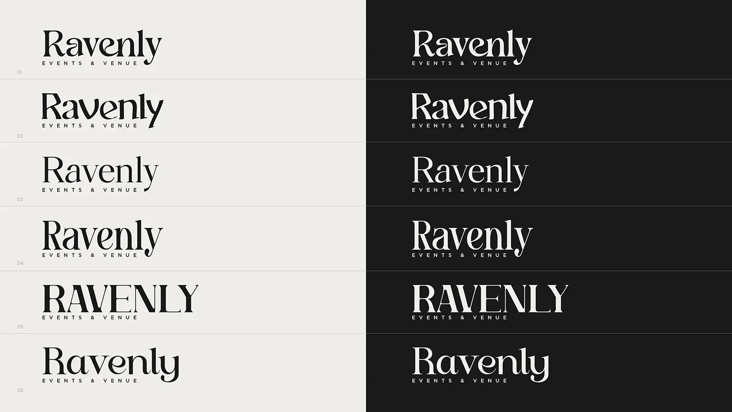
A couple of decisions clicked along the way. Rather than pick one "look," we treated the watercolors, feather textures, and raven prints as flexible brand assets and kept the core wordmark solid and bold — so the logo stays stable while the world around it can shift depending on whether it's a refined wedding invitation or a moody hero image. And at one point Amanda wondered if a different primary font might be better; I built out alternatives, we compared them side by side, and she landed back on the original with a laugh that the grass isn't always greener. Worth the detour — now she knows it's the right one.
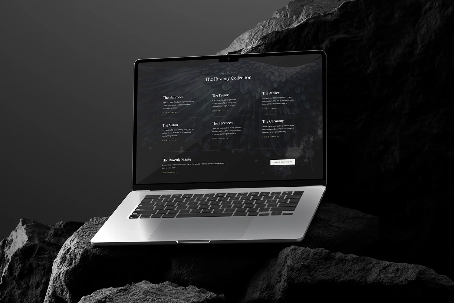
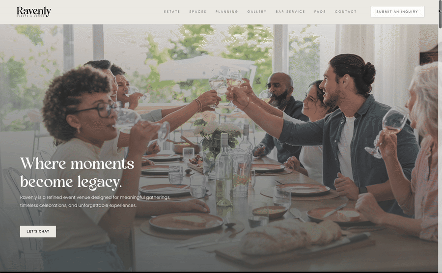
With the identity locked, we built a full brand guideline and then moved into the website — launching first as a story-driven landing page while renovations were underway, with the plan to grow it into the full site (venue, events, gallery, collections, contact) as Ravenly opens.
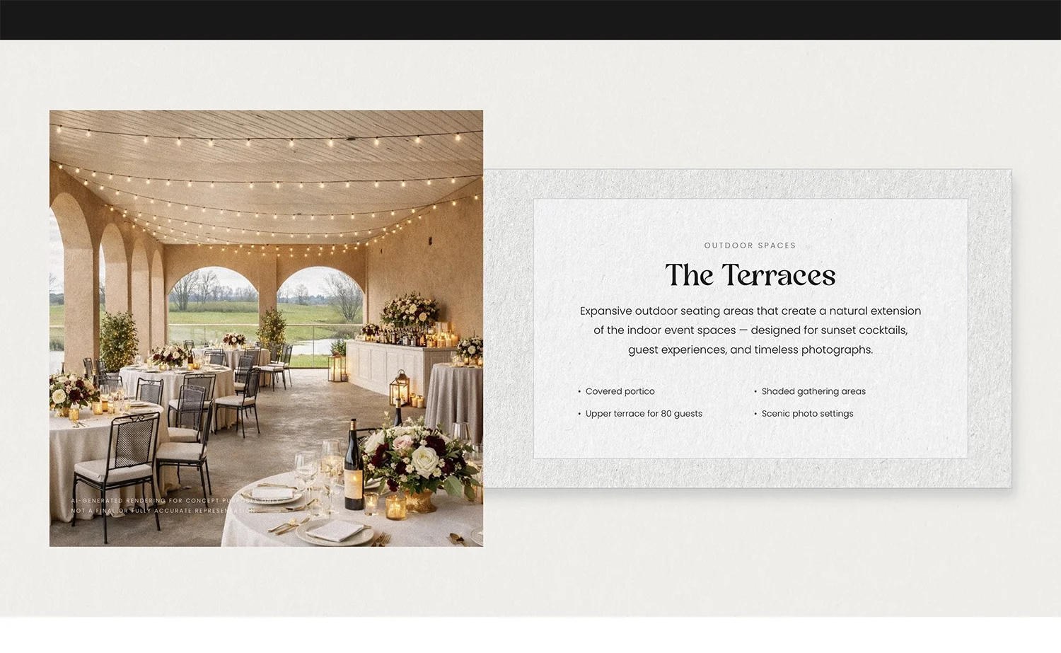
A few things guided the build. Real over generic: Amanda was clear she didn't want the anonymous stock-venue look the property's previous owners had used, so we leaned on close, textural imagery now and built everything to swap in her own photography the moment the weather and the cleanup allowed. And clarity over clicks: she wanted a site that felt clean and never made anyone dig, so we kept navigation tight and the path to "inquire" obvious. The site also flexed with her real business as it formed — when her booking system changed, we swapped the embedded forms; when pricing needed to live somewhere discreet, we built a clean, menu-style hidden page she could share by link.
Ravenly ended up with a complete identity and a living website — a brand bold and warm enough to carry a venue that's still taking shape, and a foundation ready to grow as the doors open.
But the part that stuck with me most was something Amanda shared near the end. She told me that whenever the renovation gets overwhelming and she feels pulled in ten directions, she goes back to the branding to refocus — that it had become the anchor for the whole project, the thing that reminds her what Ravenly is supposed to feel like at its core.
That's what a brand is supposed to do. Not just sit on a sign, but give you something to steer by. She saw Ravenly clearly from the very beginning; my job was just to hand it back to her in a form she could build everything else around.
More from Inflow
Like this project? If this is the kind of work you want for your own business, let's talk. Email me at → contact.inflowdesigns@gmail.com